by hankinslawrenceimages | Mar 29, 2019 | Photo Tips
One of the questions I get asked occasionally is how do I know how to compose my flower photos?
In some ways, my approach is to use what Ansel Adams referred to as visualization or “the ability to anticipate a finished image before making the exposure.” If I can see the final image before I take it, I can identify what it is about the scene I want to capture. And then I know how to compose my photograph.
Even if I can’t see the final image in my mind, if I can identify what it was about a scene that made me want to take photograph, I find it easier to compose my image. I ask myself why am I stopping here to take a photo? Why here and not over there? Why this flower and not that flower?
In other words – what caught my eye?
Sometimes is can be a single flower
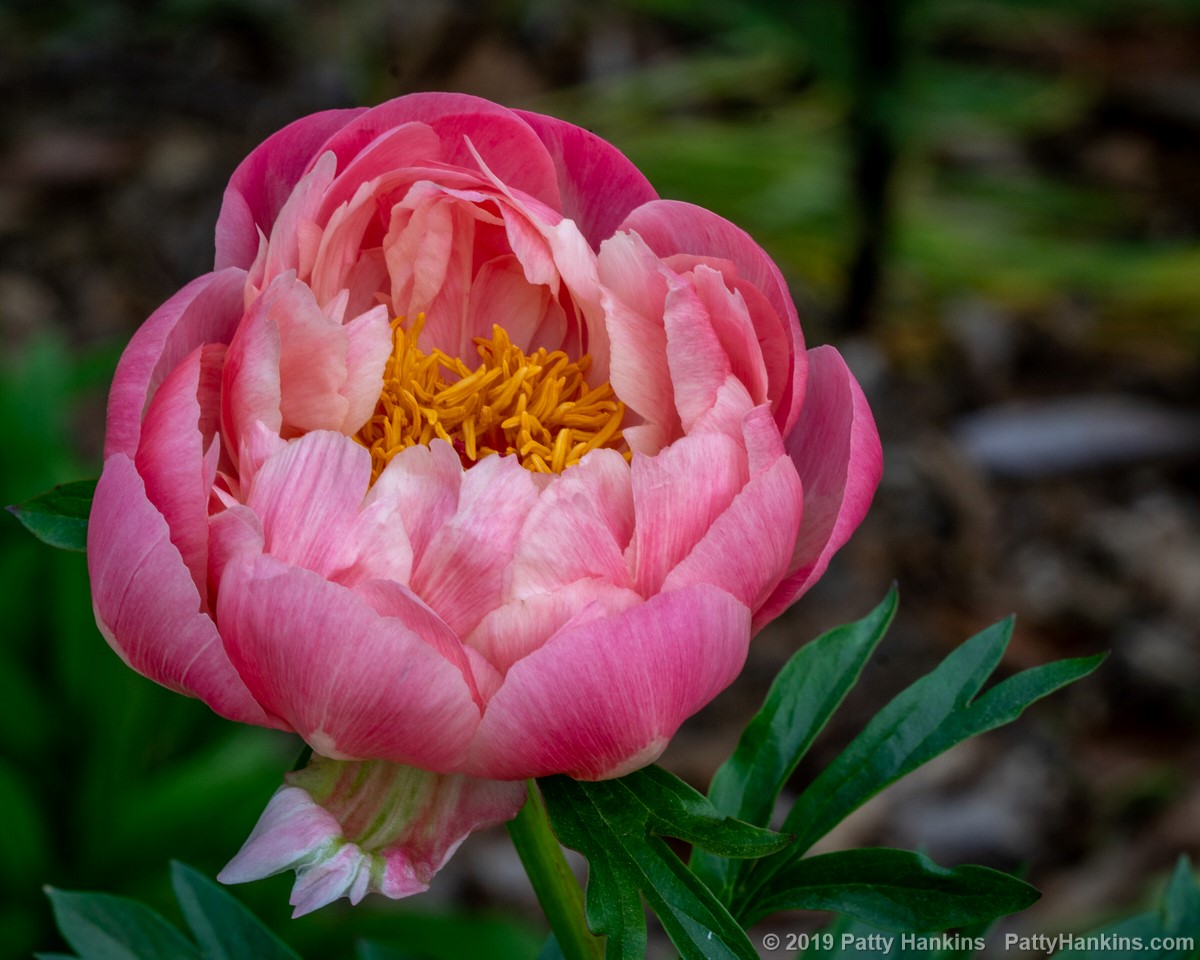
Pink Peony © 2019 Patty Hankins
Or a group of similar flowers.
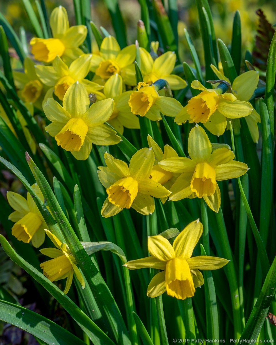
Daffodils © 2019 Patty Hankins
It can be a color
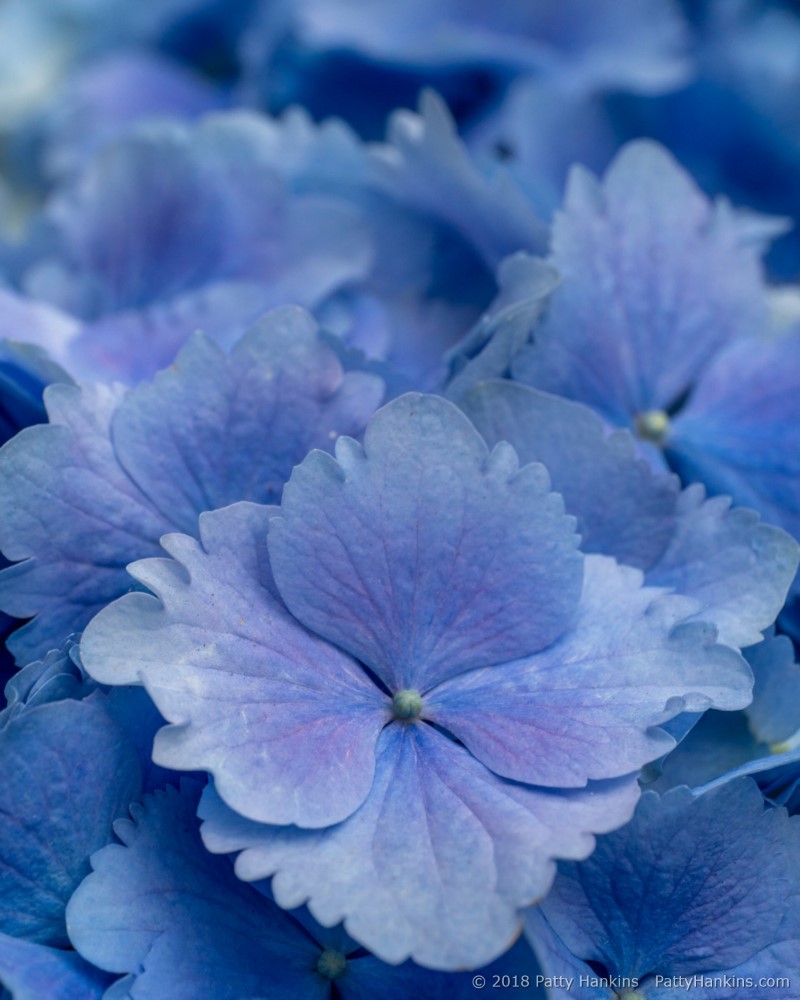
Blue Hydrangeas © 2018 Patty Hankins
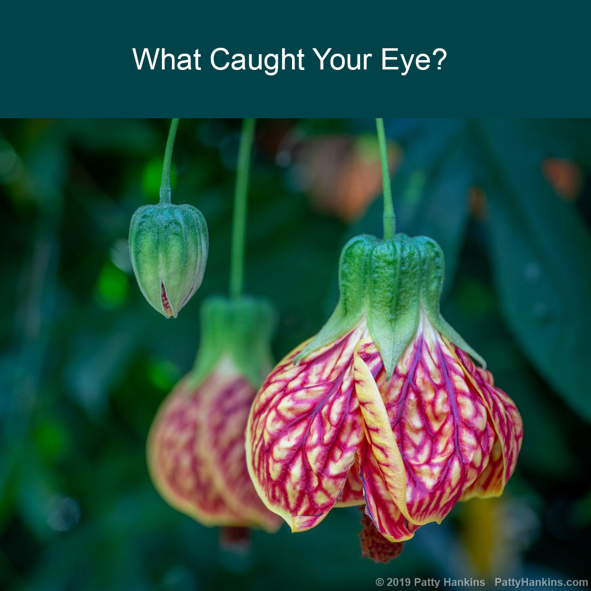
Or a combination of colors
‘
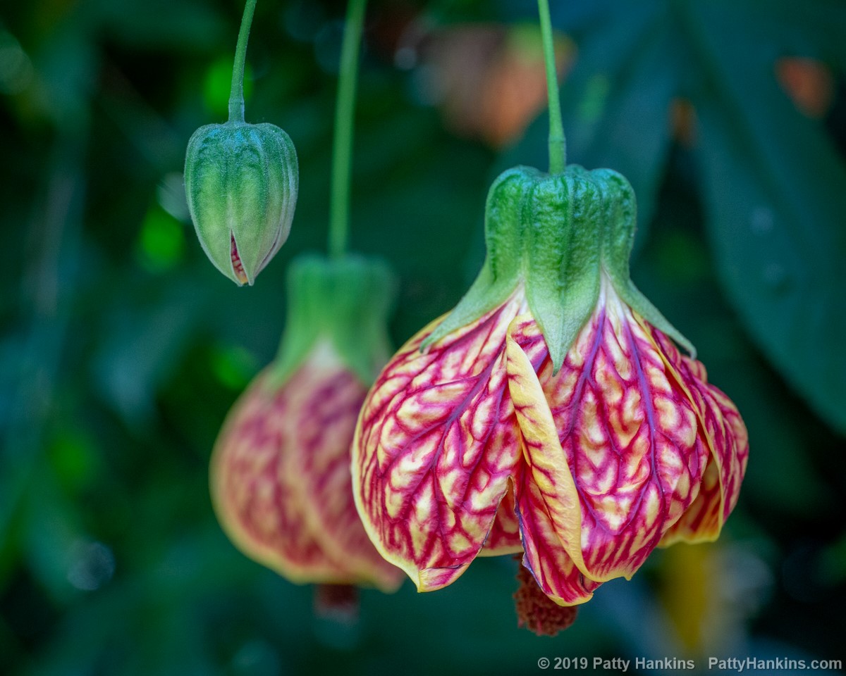
Red Tiger Flowering Maple © 2019 Patty Hankins
It can be the whole scene
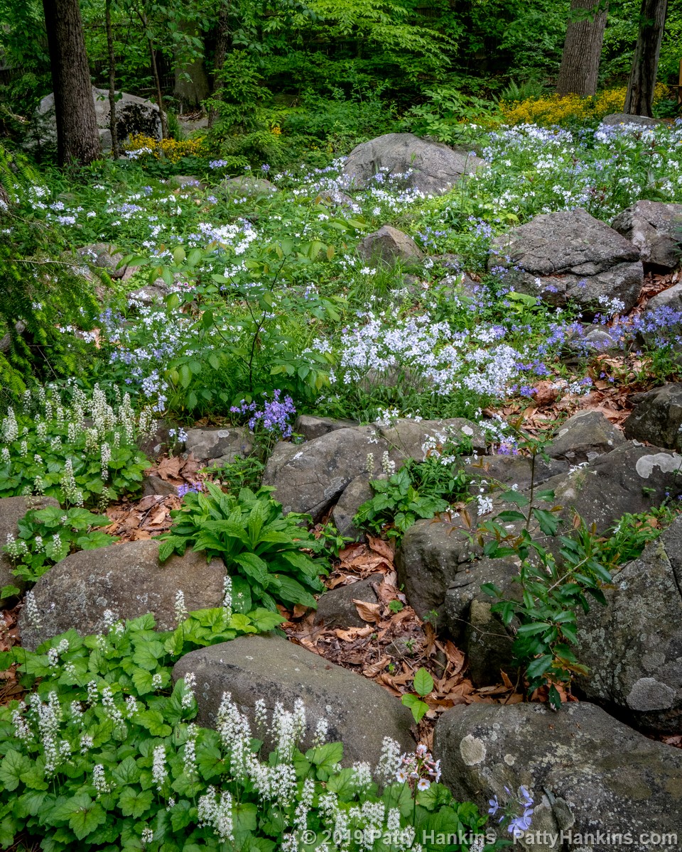
Wildflowers in the Woods © 2019 Patty Hankins
Or it can be the little details
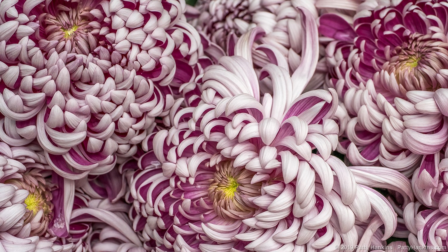
Kournan Kouryou Chrysanthemum © 2019 Patty Hankins
It can be a line
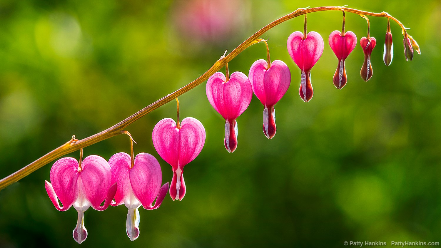
Bleeding Hearts © 2018 Patty Hankins
Or it can be something totally unexpected.
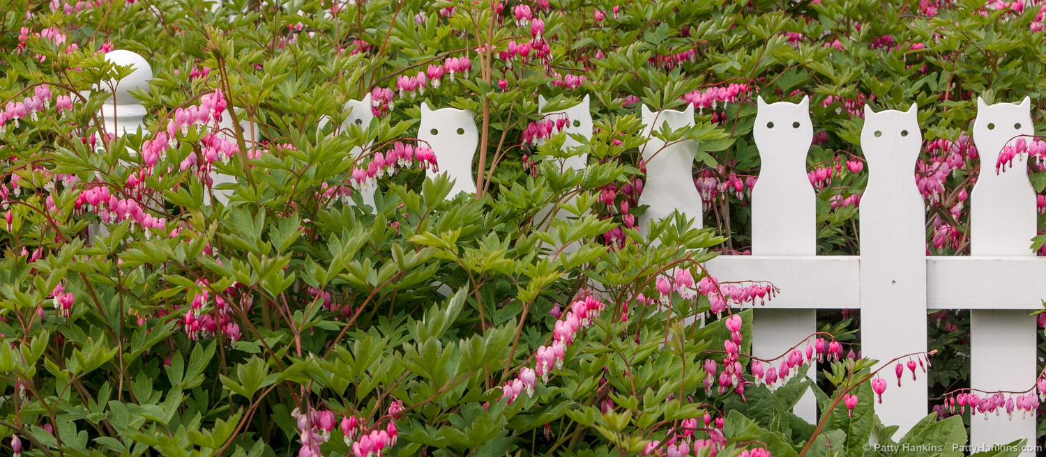
Along the Fence © 2014 Patty Hankins
As you think about your own photography, what sorts of things catch your eye? And how can you use that information to create better photographs. I’d love to hear in the comments section below
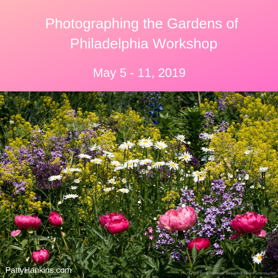
Identifying what caught your eye and how to use that as a tool for composing your photographs is one of the skills we’ll be talking about during my Gardens of Philadelphia workshop from May 5 – May 11. For more information about the workshop, visit https://beautifulflowerpictures.com/store/photographing-the-gardens-of-philadelphia-may-2019/
by hankinslawrenceimages | Feb 8, 2019 | Photo Tips, Uncategorized
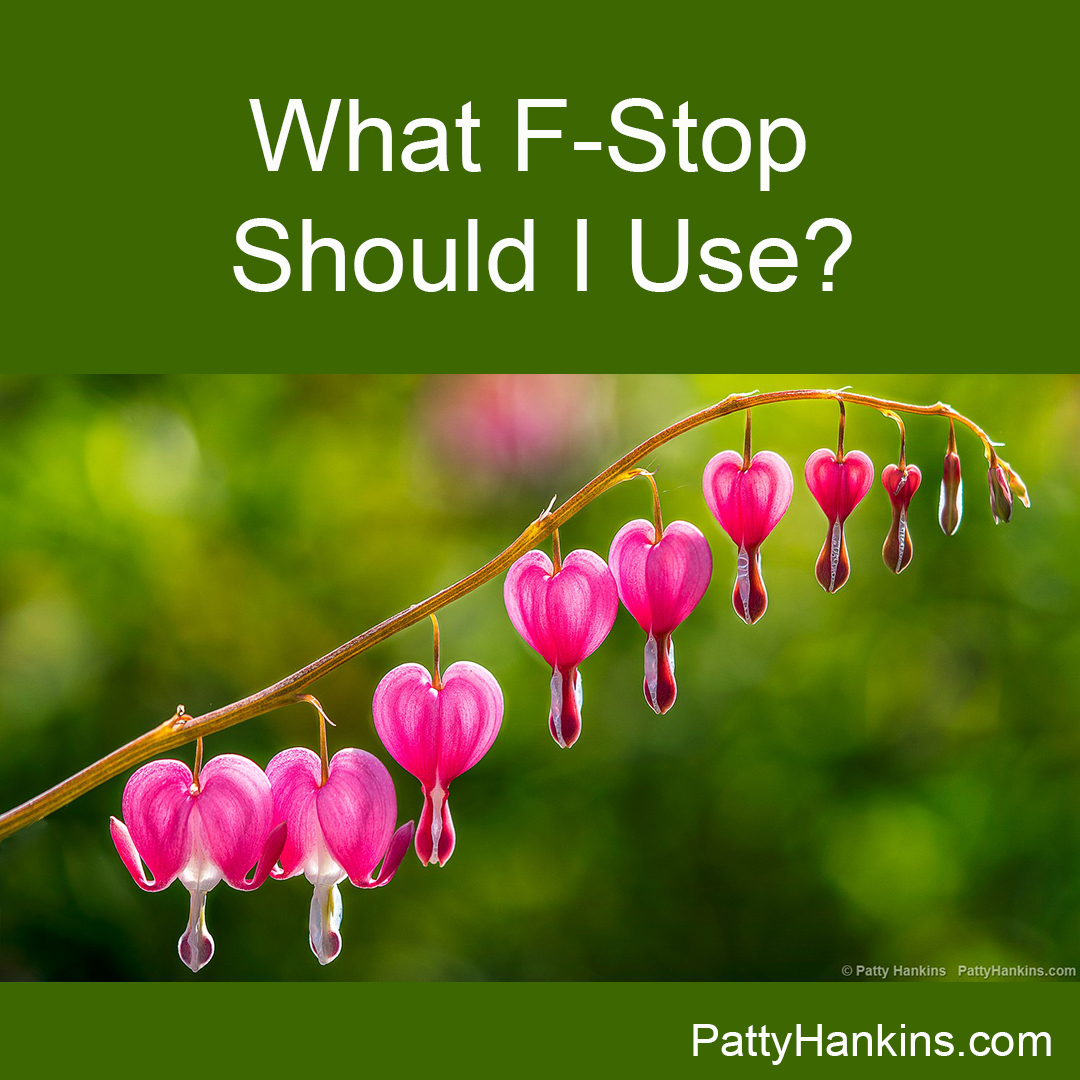
One of the questions i get asked all the time is what F-stop do I recommend for photographing flowers? My answer is It depends . . . on what lens you’re using, what your subject is, how close to your subject are you and most of all – how much of your subject do you want in sharp focus?
When you choose your F-stop, you will determine how much of your photograph is in sharp focus. This amount is sharp focus is known as Depth of Field.
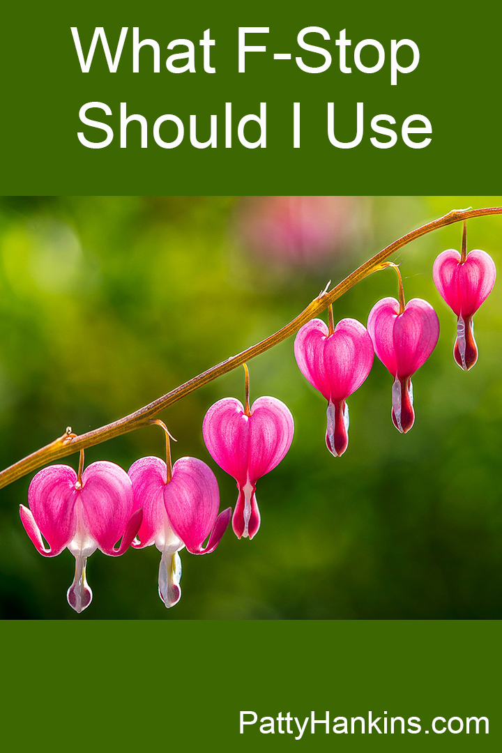
Sometimes, I use a shallow depth of field so that I can isolate the flowers I’m photographing from the background like I did in this photograph of bleeding hearts. I knew that I only wanted the flowers to be in sharp focus. So with my camera set for Aperture Priority, I set my F-Stop to 2.8 – the smallest number F-Stop available on that particular lens. I knew this would give me the shallowest depth of field I could get given the lens I was using
Bleeding Hearts © 2018 Patty Hankins
Sometimes, I use a large depth of field so I can show every detail in a flower in sharp focus. When I photographed this orange parrot tulip in my studio, I set my F-Stop to 32 – the largest F-Stop available on that lens. I knew this would allow me to share every detail of the flower and since I was photographing against a white background, there wouldn’t be all sorts of details in sharp focus to distract you from my subject.
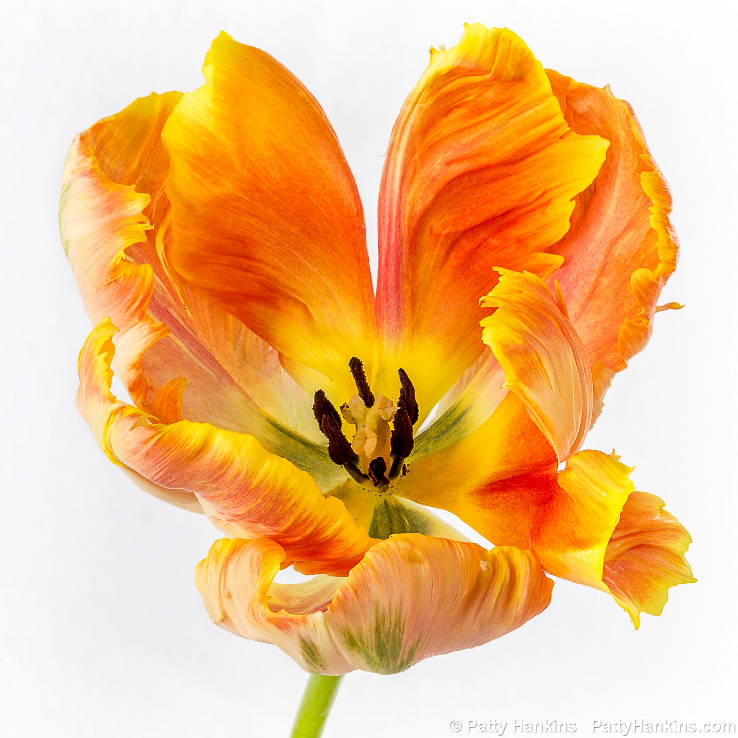
Orange Parrot Tulip © 2018 Patty Hankins
Usually I use a depth of field somewhere between a very shallow depth of field and a large depth of field. I want to share the details of a beautiful flower while not distracting you from my subject by have a busy background. In this Bluebird Columbine photograph, I set my F-Stop to 8 – which gave me a wide enough depth of field to have the flower in sharp focus – and shallow enough that the details in the background greenery are a bit blurred.
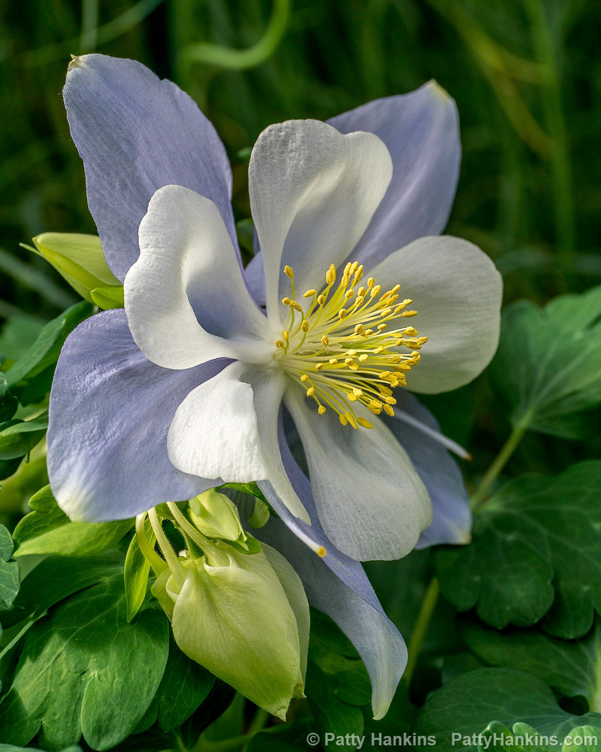
Bluebird Columbine © 2018 Patty Hankins
So as you can see – the answer to the which F-Stop question is – it depends on what you want your final photo to look like.
We’ll spend time working with F-Stops and Depth of Field during my Gardens of Philadelphia workshop in May. If you’d like to learn more about how to create photos that look the way you want them to, please join me for a week of photographing flowers and talking about photography. All the details for the workshop are on my website at https://beautifulflowerpictures.com/store/photographing-the-gardens-of-philadelphia-may-2019/
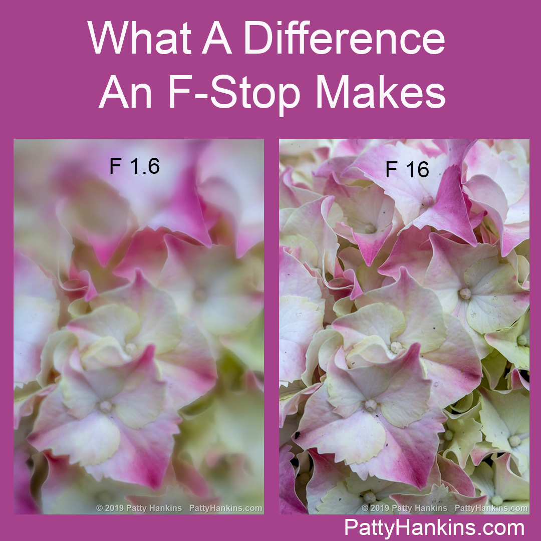
And if you’d like to see how the look of a photograph changes as you change your F-Stop – I’ve put some examples in an updated version of my What A Difference An F-Stop makes post at http://www.beautifulflowerpictures.com/blog/what-a-difference-an-f-stop-makes-updated-in-2019/

by hankinslawrenceimages | Feb 7, 2019 | Photo Tips
I originally wrote this post a few years ago – I’m updating in 2019 with some new photos and a few other edits
I recently got an email from a novice photographer commenting on how they liked that in some of my photos just one flower is in focus – and in others – everything is in focus. And they wanted to know how I got my photos to look like that. Did they need Photoshop or was there another photo editing software package that they could use?
I replied that I set my camera in Aperture Priority, and chose my F-stop based on how I wanted my photo to look – and what part of the photo I wanted to be in sharp focus.
The response I got did surprise me – they replied that it sounded challenging to do it in the field – wouldn’t it really be easier to do it in software?
At least for me, the answer to that question is NO. I would much rather think about what I want my final photo to look like when I’m in the field and do my best to capture it on my camera than to try to fix it in Photoshop later.
When I’m photographing flowers, I tend to set my camera in Aperture Priority Mode. This allows me to choose my F-Stop which lets me control the depth of field – or how much of the photo is in sharp focus.
The lower the number of the F-Stop (such as f 2.8) the wider open the aperture in the lens is – and the smaller the area in sharp focus is. Similarly – the larger the number of the F-Stop (such as F 32), the aperture opening in the lens will be smaller and the area in sharp focus will be much larger.
As just words – that really doesn’t make much sense. It’s one of these things that is much easier to show you than to explain it.
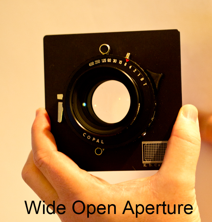
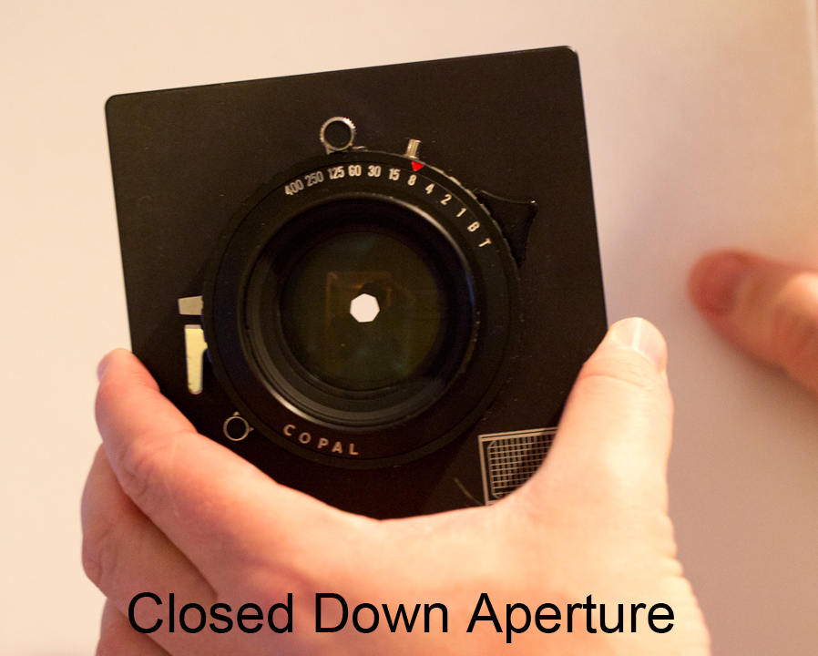
Where the F-Stop numbers came from was back in the day of manual lenses – there were blades that opened and closed to control the amount of light. The aperture or opening was wide open at F 2.8 and closed down at F 32. These photos of one of Bill’s lenses for his large format camera shows the lens blades wide open and closed down.
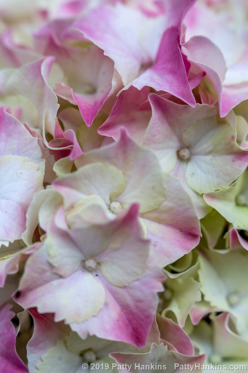
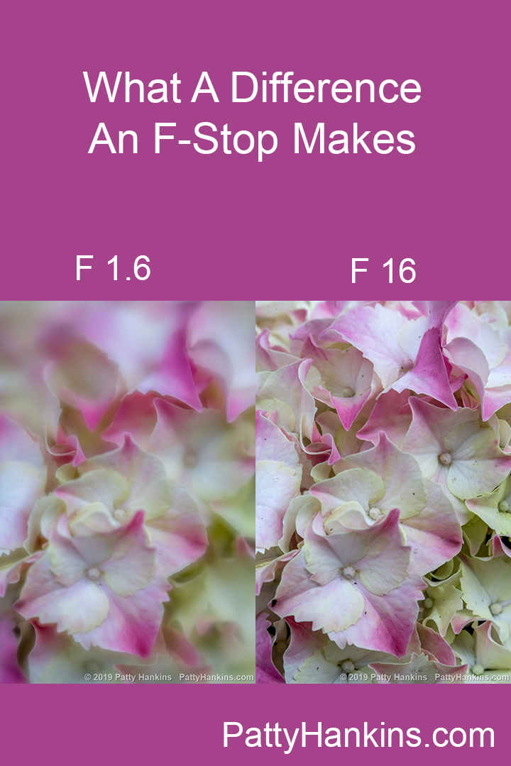
And to show how changing the F-Stop affects the look of your photo – I took a series of 8 photographs of hydrangea blossoms with my Lensbaby Velvet 56 lens. This lens is known for it’s wide open aperture of F 1.6 and it’s lovely soft focus.
The first photo was taken at F 1.6 – a wide open aperture with a very shallow depth of field. As you can see – just the edges of a few petals are in sharp focus in this photo.
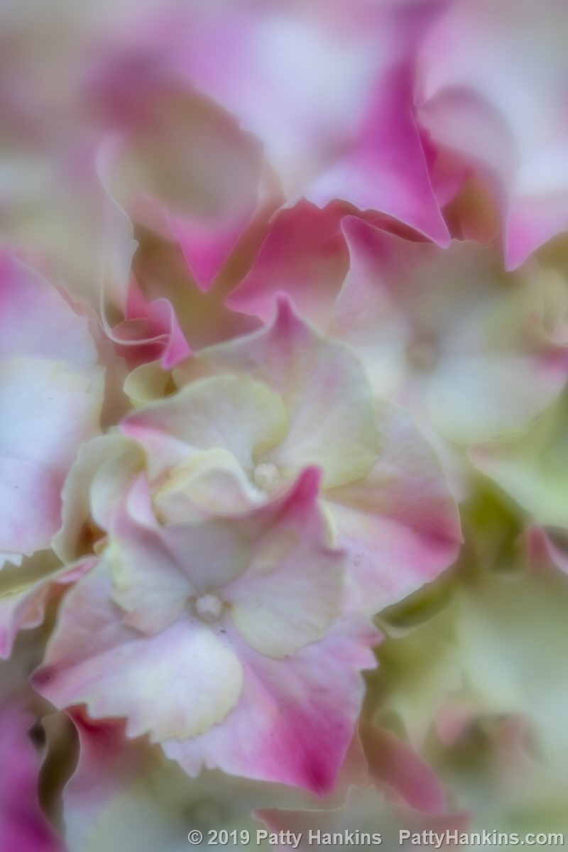
F 1.6
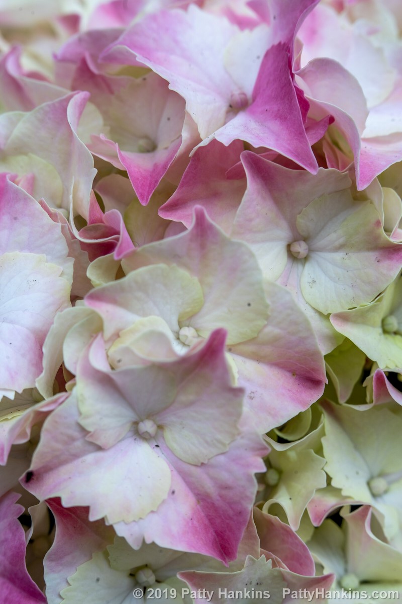
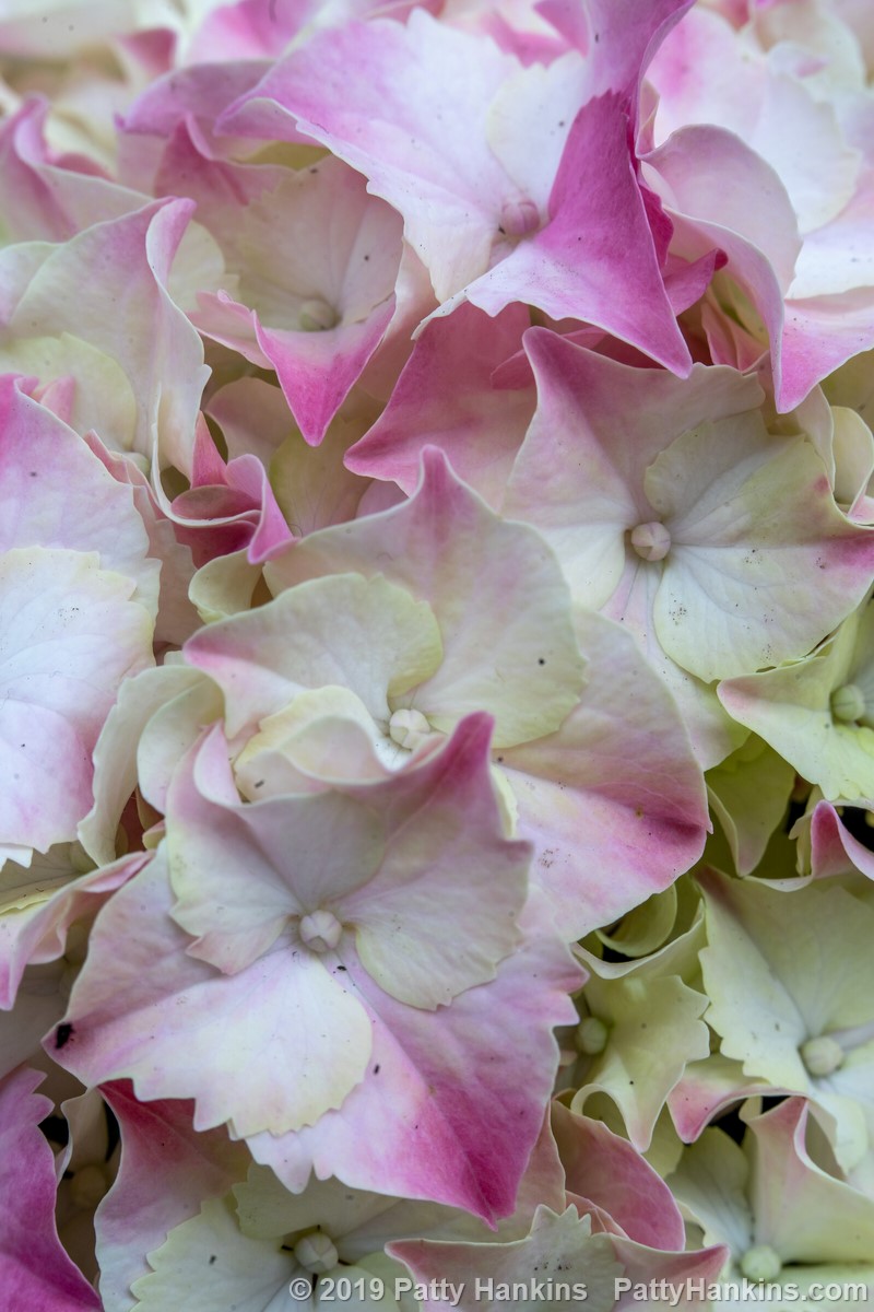
As you look through the next several photos – notice how many and how much of the blossoms in the foreground are in sharp focus and what the blossoms in the background look like
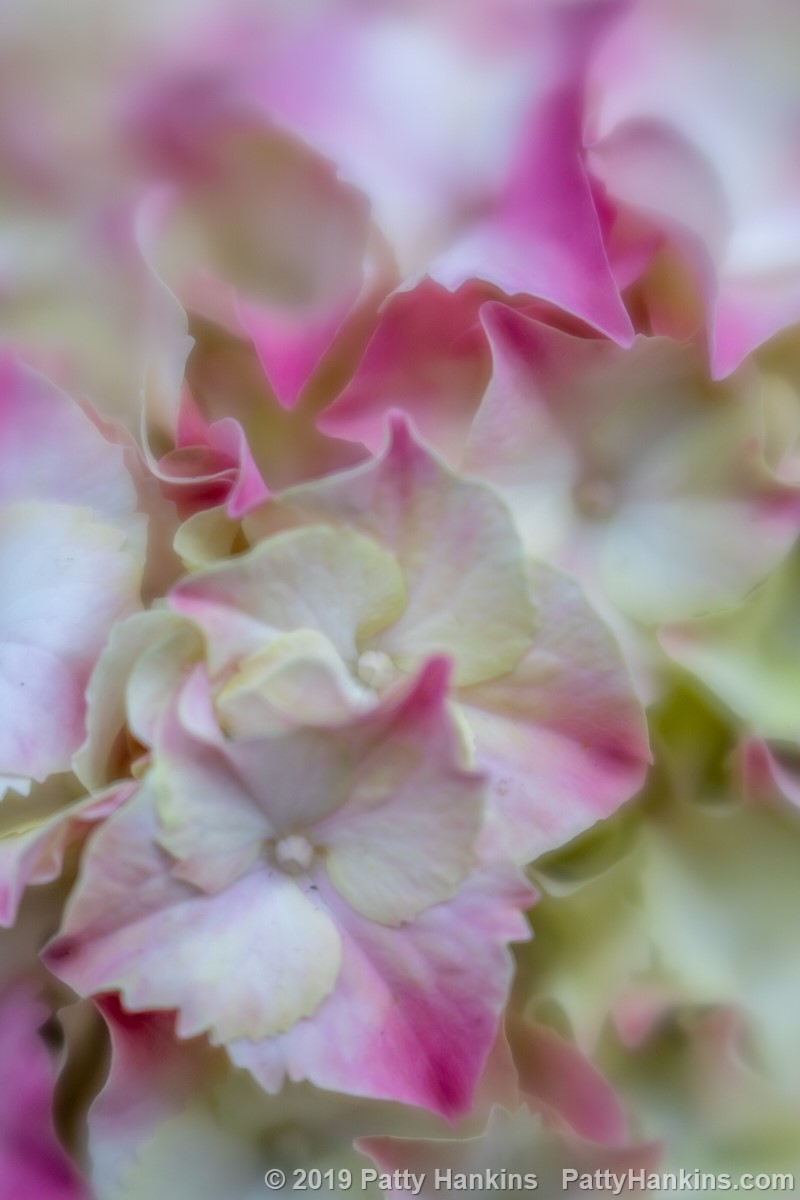
F 2
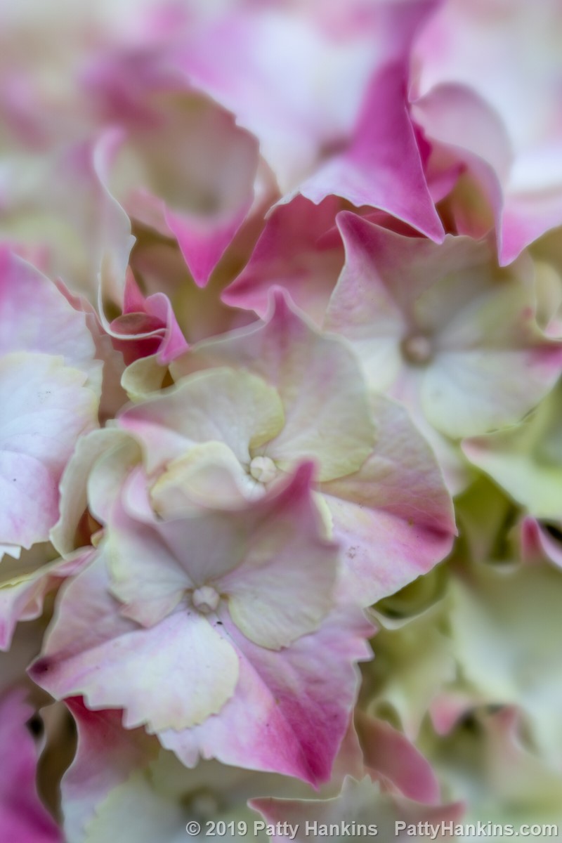
F 2.8

F 4
F 5.6

F 8
F 11
The last photo was taken at F 16 – the narrowest aperture available on this lens. Almost everything in the photo is in sharp focus.y narrow aperture with a large depth of field. Just about the entire photo is in sharp focus – everything from all the blossoms to the leaves in the background are clearly defined.
F 16
And what’s great is that you get to decide how much of your photo will be in sharp focus and what your final photo will look like – simply by choosing the F-Stop that lets you create the photo you want to share with the world.
We’ll spend time working with F-Stops and Depth of Field during my Gardens of Philadelphia workshop in May. If you’d like to learn more about how to create photos that look the way you want them to, please join me for a week of photographing flowers and talking about photography. All the details for the workshop are on my website at https://beautifulflowerpictures.com/store/photographing-the-gardens-of-philadelphia-may-2019/
by hankinslawrenceimages | Jan 25, 2019 | Photo Tips
One of the questions I get asked on a pretty regular basis is how do I edit my photos? And usually the person asking wants to know in what order do I do things – so I thought I’d share some info about how I approach editing a photo with you today.
The first thing I do is decide which photo I want to edit. On a day I head to a garden to photograph, it’s not unusual for me to take a few hundred (if not several hundred) photographs. I’ll do a quick sort and delete out all the photos I know I’ll never edit – the composition isn’t right, the exposure isn’t right, etc. Then I’ll go through and select from the rest which I want to edit. And then choose one to be the first to edit.
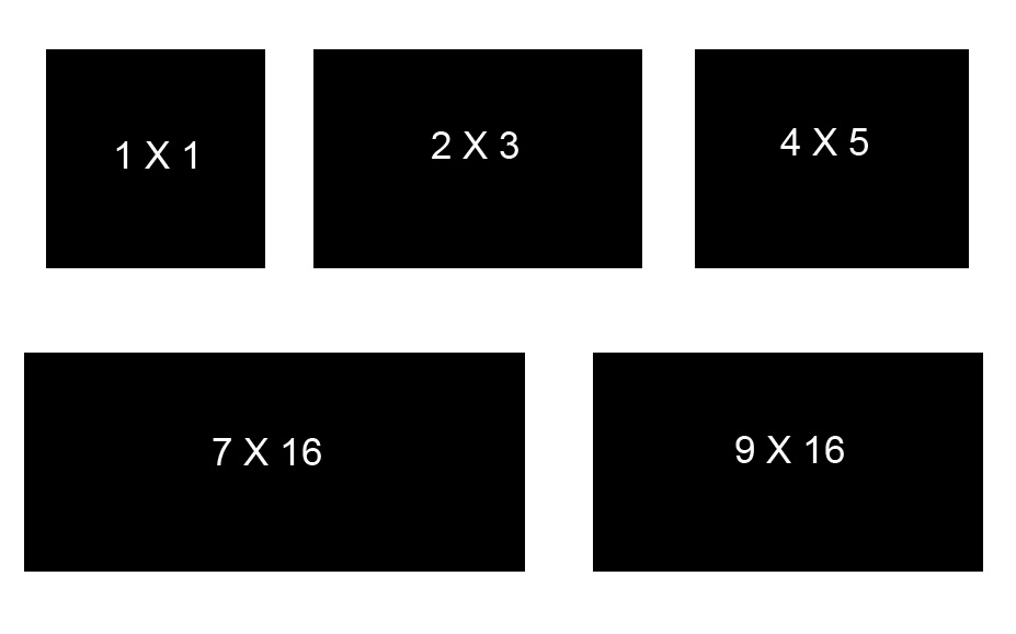
Once I’ve decided which photo to edit, I take a moment and think about what I’d like my final image to look like. This helps me make the first decision – how am I going to crop the photo. I tend to crop to one of several aspect ratios – rectangular (2X3 or 4X5), square (1X1) or panoramic (7X16 or 9X16). When I crop my photos, I always do it non-destructively in Lightroom or Photoshop so I can always go back and try another crop if I decide later I didn’t choose correctly the first time.
Next step is to clean up the cropped image. This involves things like removing spots from sensor dust, removing telephone wires, etc. I do minor cleanups in Lightroom using the Spot Removal tool. For more extensive cleanups, I head into Photoshop and use the patch, heal, clone or content-aware fill tools.
Before Contrast Adjustments
Next step is to work on contrast throughout the image. This is when I make global adjustments to the light, dark and midtones in the photo. Most of the time I do this in Lightroom using the sliders in the Basic Panel. Usually with a few adjustments to the Contrast, Highlights, Shadows, Blacks and Clarity sliders, I’ve got my photo closer to looking the way I want it to.
After Global Contrast Adjustments
Once I’ve done my global contrast adjustments, I’ll look at the overall colors issues in the photo. Again, I tend to use Lightroom for the global color adjustments. I’ll use the temperature and tint sliders to adjust the white balance, and that’s usually all I do. I’ll sometimes use the Hue/Saturation/Luminance sliders to adjust specific sets of colors. I tend to adjust the greens and the yellows in my flower photos – usually darkening them down a bit so that the colors in the flowers pop a little more.
After Global Color Adjustments
Oftentimes the global edits are all I need to do if I’m just planning on sharing an image on the web. If I’m going to print an image, I’ll switch over to Photoshop and make color and contrast adjustments that affect part of the image. I find it easier to make local adjustments using Photoshops Layers and Masks than to do them using Lightroom’s Adjustment brush.
My last steps are to sharpen the photo and export it for the web or for print.
I’ll be teaching more about how I do quick edits in Lightroom during my Gardens of Philadelphia workshop from May 5 – 11, 2019. I’d love to have you join me for a week of photographing flowers and improving your photographic and editing skills. All the information about the workshop is at https://beautifulflowerpictures.com/store/photographing-the-gardens-of-philadelphia-may-2019/
by hankinslawrenceimages | Oct 26, 2018 | Photo Tips, Photoshop, Software
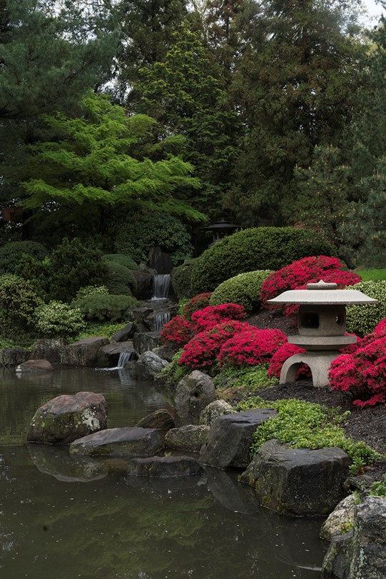
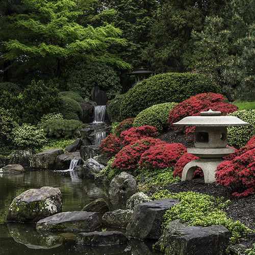
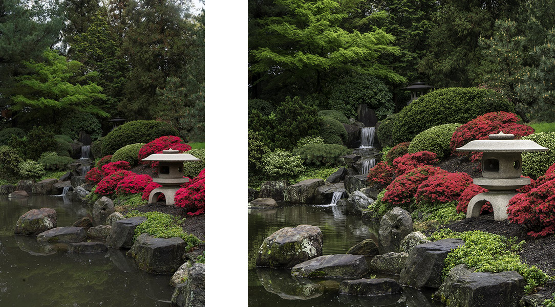
Well – that’s an impressive sounding title! What it really means is I’m going to share the step by step edits I made on my In the Shofuso Japanese Garden photograph.
On a visit to Shofuso Japanese Garden in Philadelphia I was captivated by the scene in front of me. I saw a line of water and the waterfall leading my eye to the temple in the trees. I saw azaleas and another small temple on the right framed by the water on the left. And finally, I saw the wonderful bright greens of spring.
Here’s what my camera captured.
The first edits I made were done in Lightroom – where I cropped the photo to a square format and did some global adjustments (changes that affect the entire photograph) to brighten up the photo and increase the contrast just a bit.
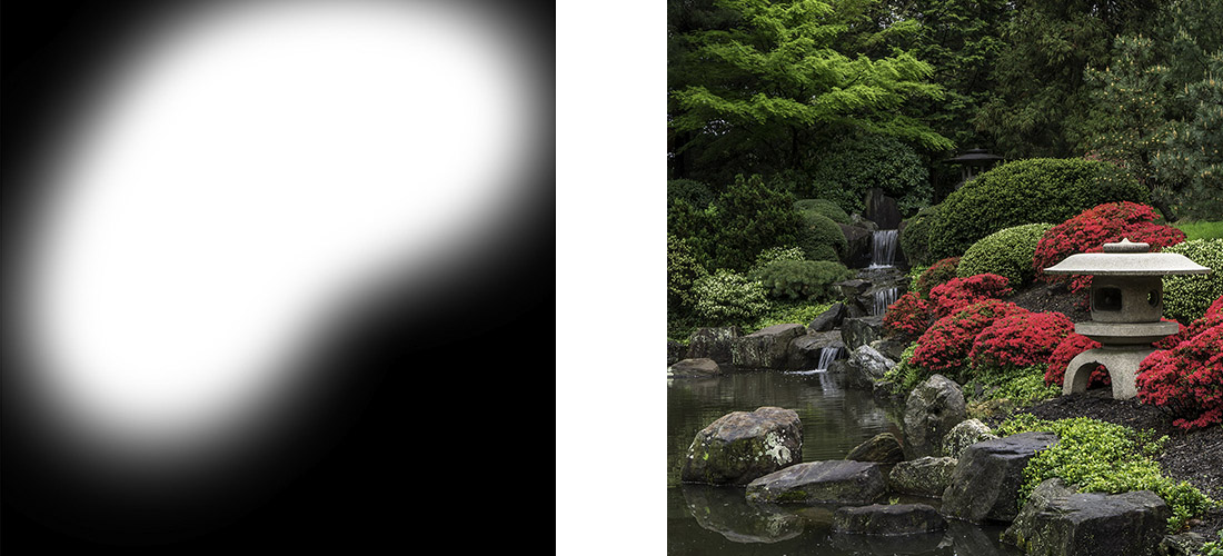
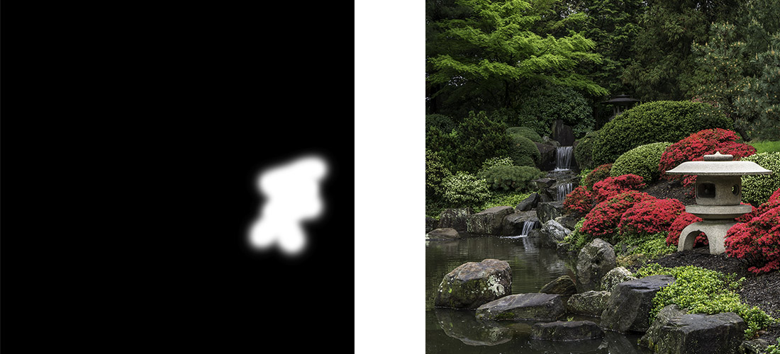
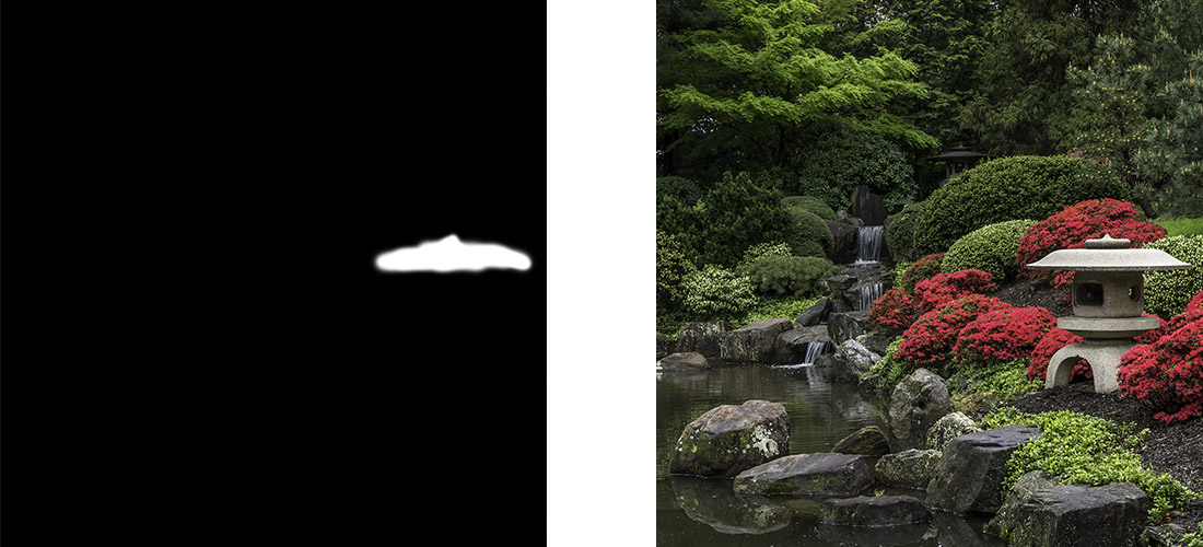
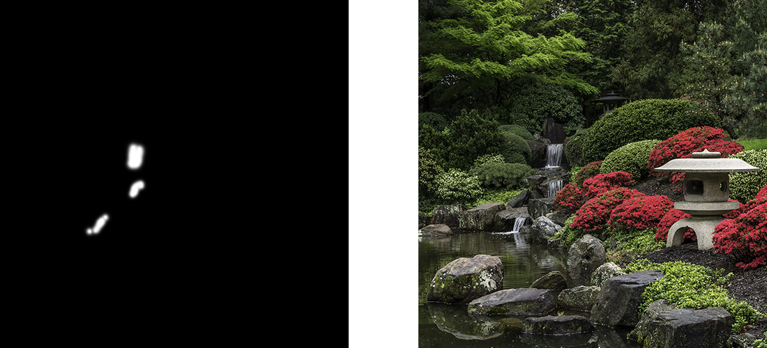
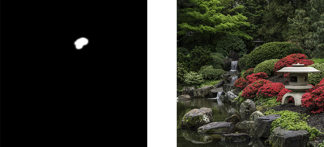
And then I headed into Photoshop to make a series of local adjustments (changes that affect just part of the photograph) tto draw your eye through the photograph so you saw what I saw that day in the garden. I used a series of layers and masks to make the local adjustments. I’m including screenshots of the masks so you can see just what part of the image I’m working on. In Photoshop, a mask allows you to choose where in your photo you want a change to apply. In white areas of the mask – the change is seen. In black areas of the mask – the change doesn’t affect the photograph.
My first change was to use a curves layer to brighten up the background. The background just too dark before I brightened it up
Next I used a curves layer to brighten the front temple. As I looked at the photo, the front temple felt like a dark heavy object in the photo and I wanted to lighten it up a bit.
Followed by another curves layer to darken the top of the front temple. Once I made the changes to temple in the previous step, the top of the temple was too bright and drew my eye away from the water, so I darkened it down a bit.
The next curves layer increased the contrast in the water. One of the things that really attracted me to the scene was reflection of the trees in the water, highlighting the beautiful greens of spring. By increasing the contrast in the water, I could bring out the reflection.
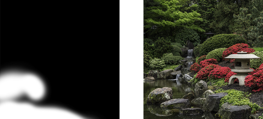
An then a curves layer to brighten the waterfall. As I took the photograph, I saw a line of water leading from the front of the scene, back through the reflections, up the waterfall to the back temple. By brightening up the waterfall, I can help you see the same line.
And another curves layer to brighten up the back temple. The leading line I saw ended at the temple in the back. In the photo, after I had brightened up the water, the temple was getting lost in a dark spot.
And yet another curves layer to brighten the reflections in the water. I love seeing that wonderful shade of yellow green in the spring, and I saw it reflected in the water at the garden. By brightening up parts of the reflection, I could share that same shade of yellow green with you.
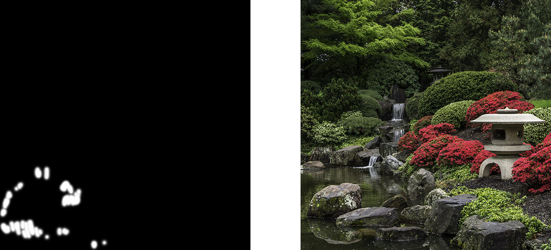
Followed by a hue/saturation layer to tone down the reds in the azaleas. With all the adjustments I’d made, they were just a little too bright. I didn’t need to use a mask on this step since the only reds in the photo are the azaleas so my change to the reds didn’t affect the rest of the photo. If there had been other reds in the photo that I didn’t want to tone down, I would have made a mask and just had the change affect the azaleas
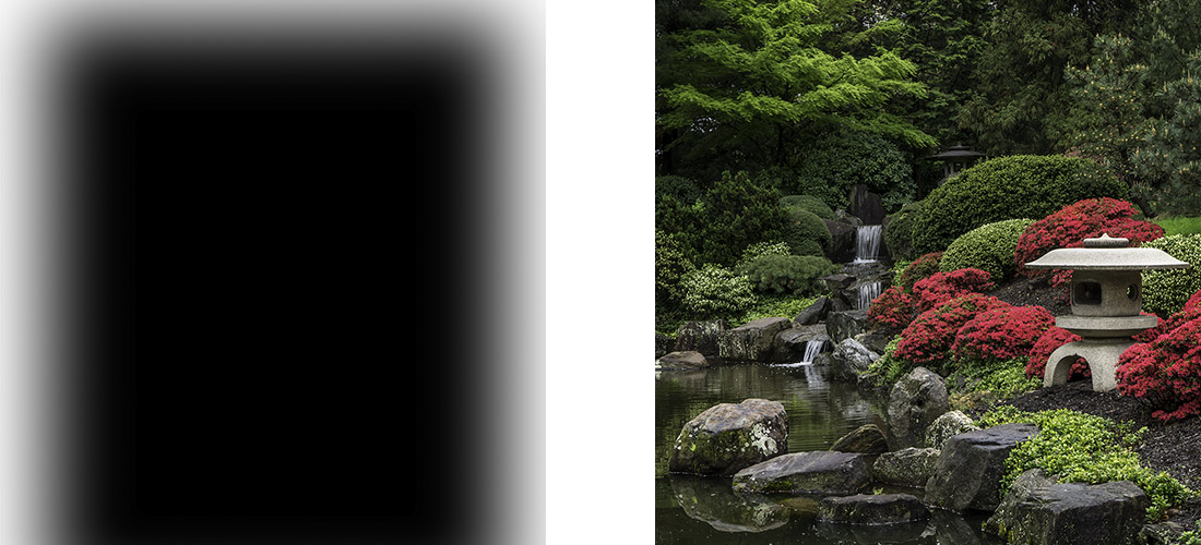
And finally a last curves layer to add a vignette to the photograph. I wanted to darken down the edges and corners to draw your eye into the center of the photograph.
My last step was just to do a little sharpening on the photo. Since I photographing in RAW mode, no sharpening is applied when I capture my image, so I need to add a bit in at the end.
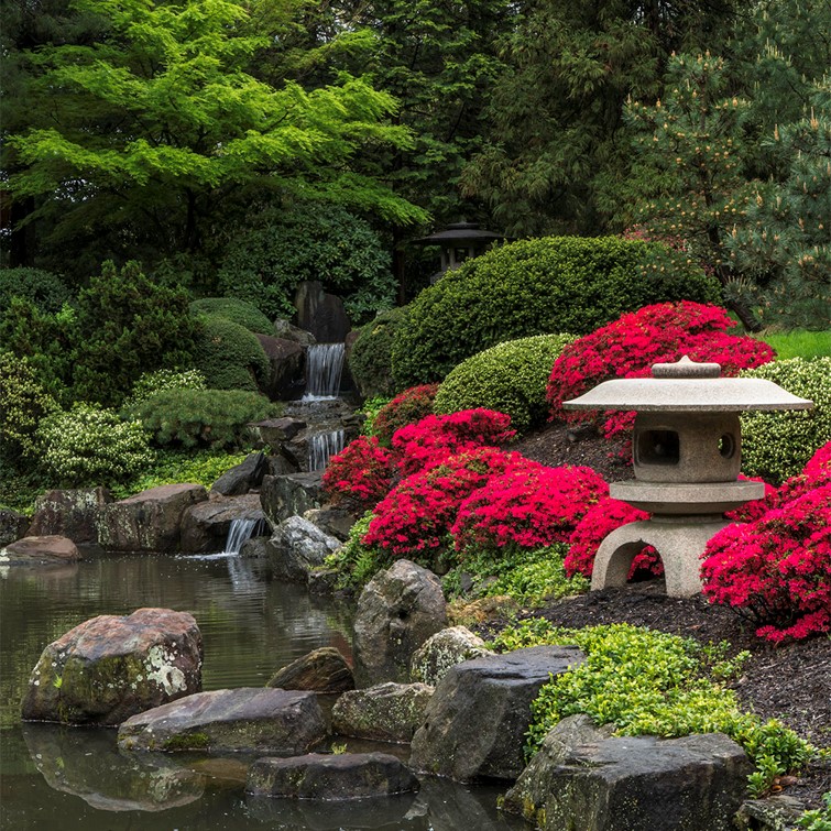
As you look at my initial capture and my final image, you can see how I used a series of small local adjustments to draw your eye into the photograph and follow the leading line from the bright reflection in the water, up the waterfall to the temple in the back. And also you can see a balance in the photo between the red azaleas and temple on the right side of the photo and the water and waterfall on the left.
My hope is that my final image allows you to see the same beautiful scene that I saw at the gardens that day.
How I edited this photograph is one of the examples I share in a talk “The Power of Local Adjustments” that I have available for presentation to camera clubs and photography groups. If you belong to a camera club or other group that might be interested in having me speak about photography and photo editing, please drop me a note. I’d love to come speak to your group.
And if you love my photograph of the Shofuso Japanese Garden, it is available on my website at https://beautifulflowerpictures.com/store/shofuso-1/
by hankinslawrenceimages | Aug 24, 2018 | Photo Tips
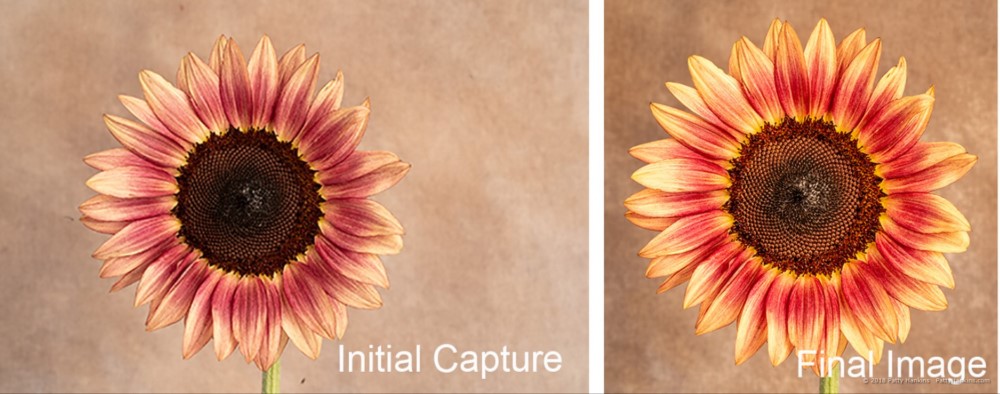
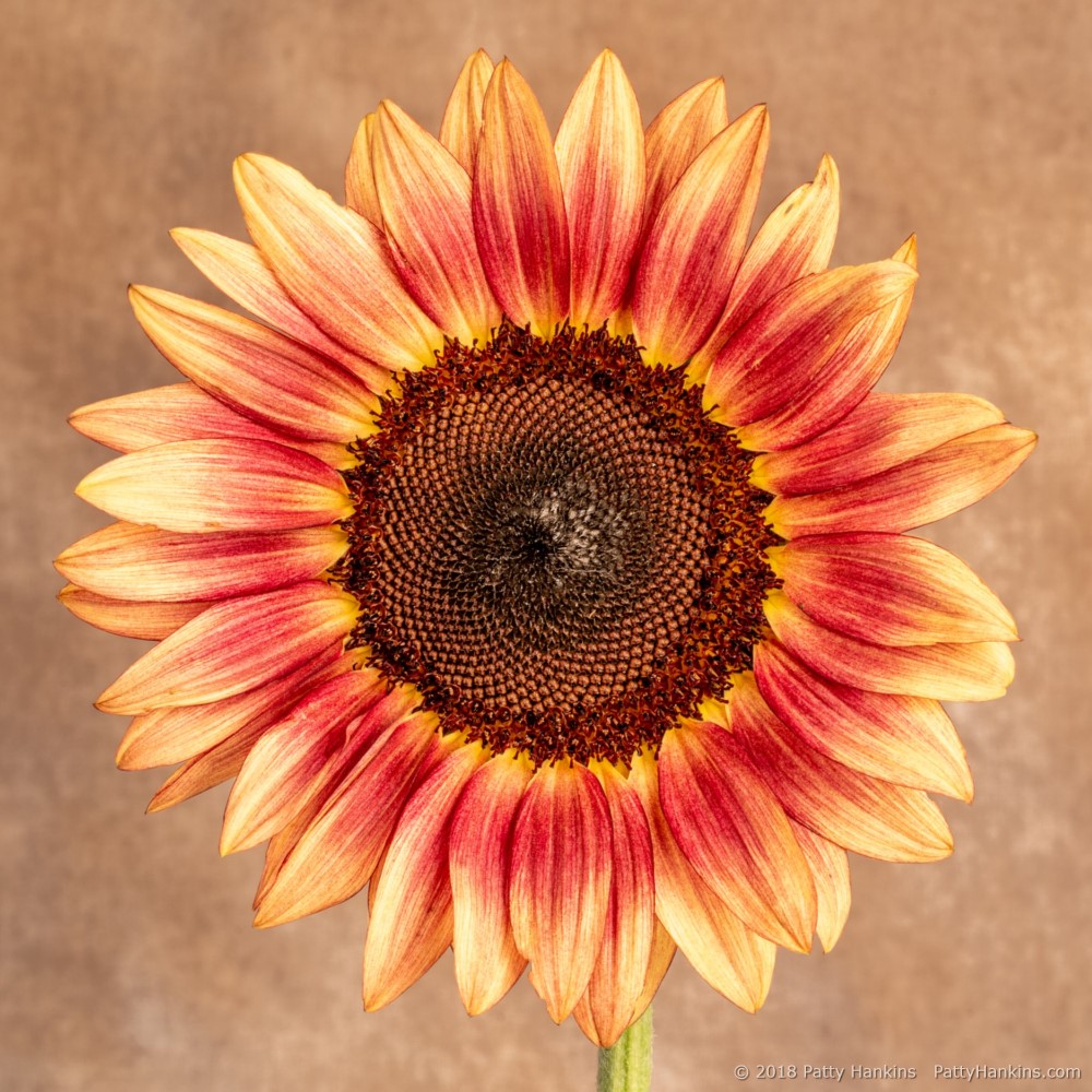
A few months ago, I shared how I edited some of my photos using both Lightroom and Photoshop. A few people asked me if I could share how I would edit a photo just using Lightroom since they aren’t comfortable using Photoshop. So I thought I’d share how I edited a photograph I took of a Plum Sunflower in my studio only using the tools in Lightroom’s Develop Module.
When I took the photo, I wanted the sunflower to really stand out from the background and have the feel of a warm sunny day. The photo was taken using my Sony A7III camera with my Canon 100mm macro lens and just the modeling lights from my strobes as a continuous light source. My ISO set at 100, aperture at 11 and a shutter speed of 2.5 seconds.
Here’s my initial capture
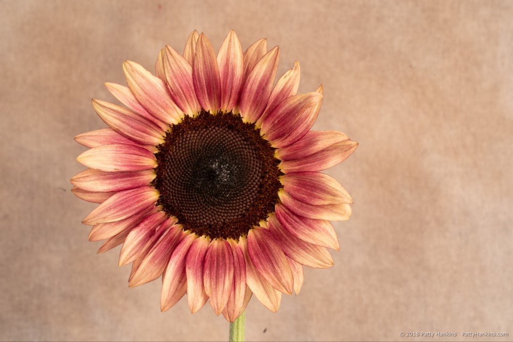
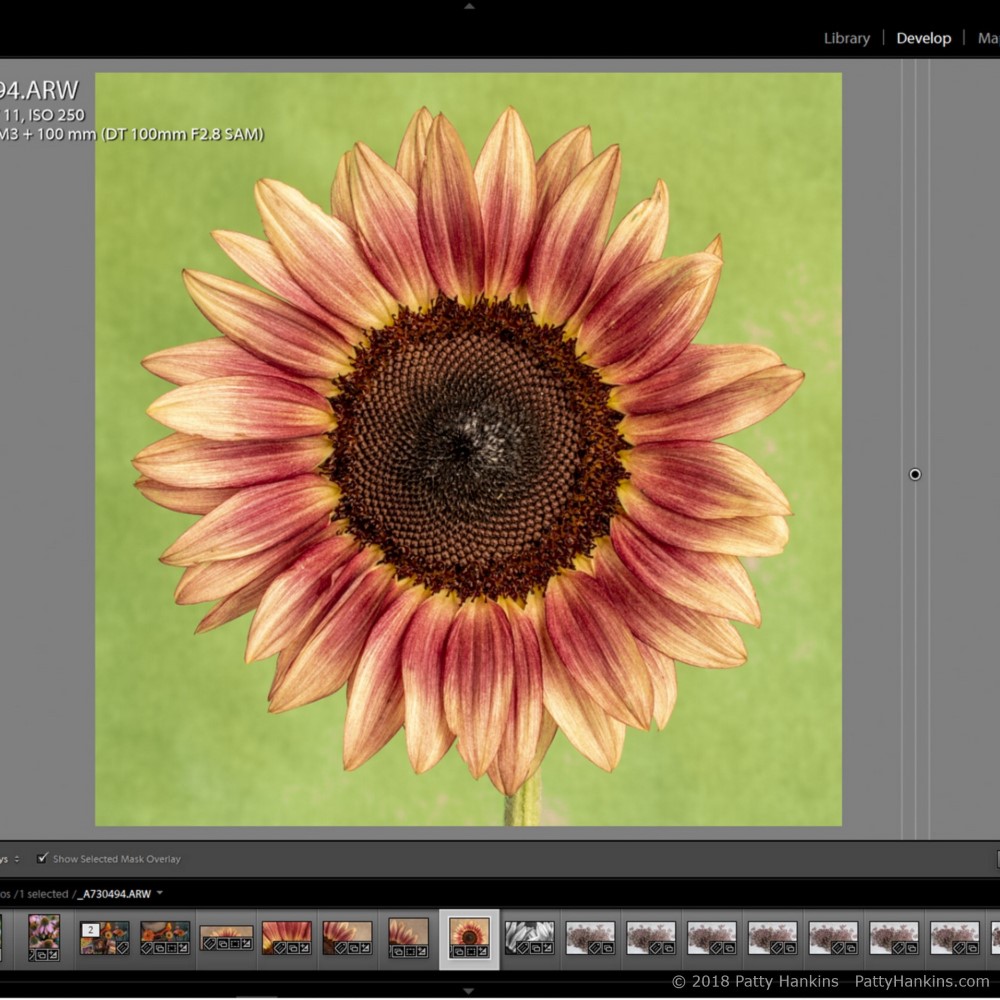
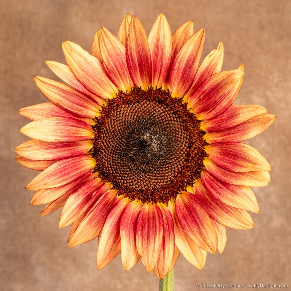
I knew I wanted my final image to be a square photograph. So here’s the photo after cropping and cleaning up a few spots of grunge.
Then I made my adjustments using the Basic Panel in the Develop Module. My adjusted settings were Highlights -100, Shadows +86, Whites +38, Blacks -48 and Clarity +14. I was adjusting the overall contrast of the scene and adding a little mid-tone contrast with the Clarity slider. I tend to use the Highlights/Shadows/Whites/Darks rather than either Exposure or Contrast since I have more control with the set of 4 sliders. Here’s my photo after my changes in the basic panel.
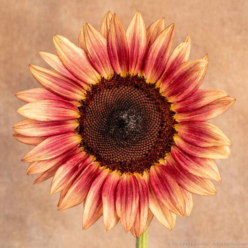
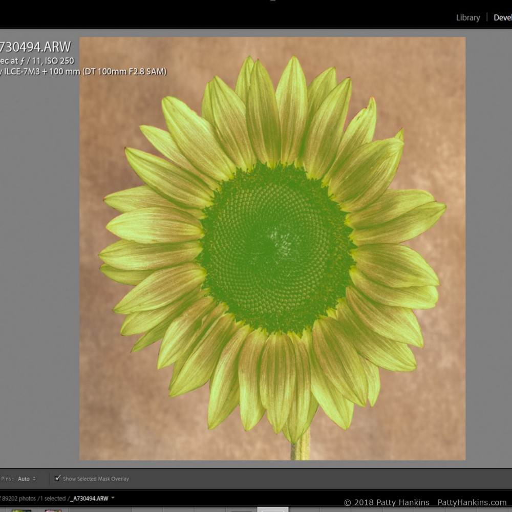
The next change I wanted to make was to darken the background. I applied a graduated filter to the entire image. I then used the Range Mask: Color to refine the mask so it just applied to the background. First I used the eyedropper to sample several areas of the background. I then adjusted the Range Mask amount to 0. Finally I used the brush to clean up a few areas of the mask. Here’s what my mask for the background looked like.
Once I had my mask created, I could make my adjustments to the background. I took the shadows to -100 and blacks to -15. Here’s the image looked like after the changes to the background.
Now that I had the background where I wanted it, I started working on brightening and warming up the flower. I used the adjustment brush to create a mask Here’s what my mask for the sunflower looked like.
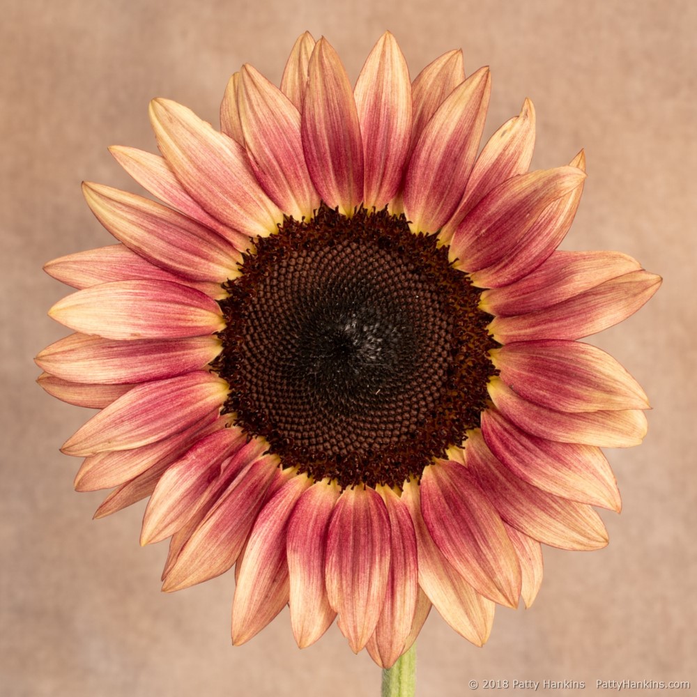
Once I had this second mask created, I could make my adjustments to the flower. I increased the temperature by 13, increased the highlights by 28 and the shadows by 26. Here’s what the image looked like after I made the changes to the sunflower.
And then I made my final changes of sharpening the photo a bit and adding a vignette. Here’s the final image
If I had been using both Photoshop and Lightroom to edit the photo, I would have switched over to Photoshop after making my changes in the Basic Panel. Adobe has improved the functionality of the local adjustment tools in Lightroom with the addition of range masks and the brush tool for the graduated and radial filters. While they still aren’t as powerful the layers and masking tools in Photoshop, you can make many types of local adjustments to your photos with them.
If you’d like to learn more about Lightroom and how I use it, I will be teaching my Introduction to Lightroom Workshop on September 29-30. We’ll be working with Lightroom’s Library and Develop Modules. By the end of the weekend you’ll know how to import, organize, and edit your photos, as well as export them for use on the web or in print, even if you’ve never used Lightroom before. The workshop is limited to 4 students, so I can make sure you get the individualized help you need. You can learn more about the workshop at https://beautifulflowerpictures.com/introduction-to-lightroom-2/
If you have any questions about how I edited my plum sunflower photo, drop me a note and I’ll try to answer them in a future Post.