by hankinslawrenceimages | Sep 6, 2019 | Photo Tips, Photoshop, Software, Workshops
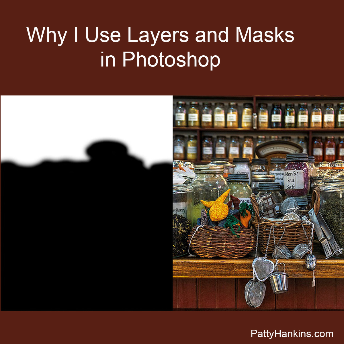
I’ve had a couple of questions recently about my upcoming Photoshop Layers and Masks Workshop so I thought I’d try to answer them for everyone today. The quesions were what are layers and masks? And why do I use them? Quite simply, layers and masks are the tools that let me take advantage of Photoshop’s photo editing power.
Layers
A layer is just a set of instructions for Photoshop to make a change to your photograph such as adjusting color, contrast or brightness. As you add additional layers of instructions, you are making additional changes to your photograph.
The power in using layers is that you can always go back and change the settings for a specific layer at any time and not lose other edits you’ve made to your photograph. You can also turn your layers on and off for a before/after comparision. You can also rearrange your layers since Photoshop reads the instructions from the bottom of your layer stack to the top.
If you just make adjustments to your photograph without using layers, you can’t go back and change an adjustment without losing all the edits you’ve made since that step.
Layers allow you to edit non-destructively. I almost always have to go back and tweat some of my changes when I’m editing a photo. Using layers allows me to make whatever changes I want to make at any stage of my editing process without losing all of my other edits.
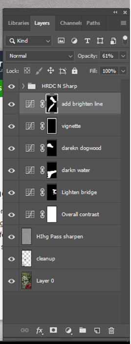
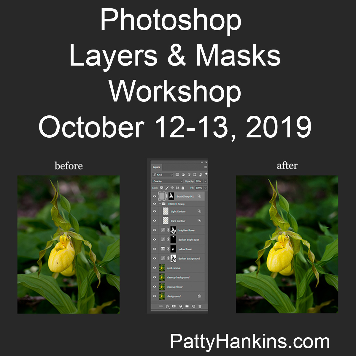
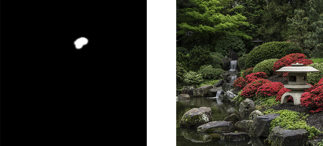
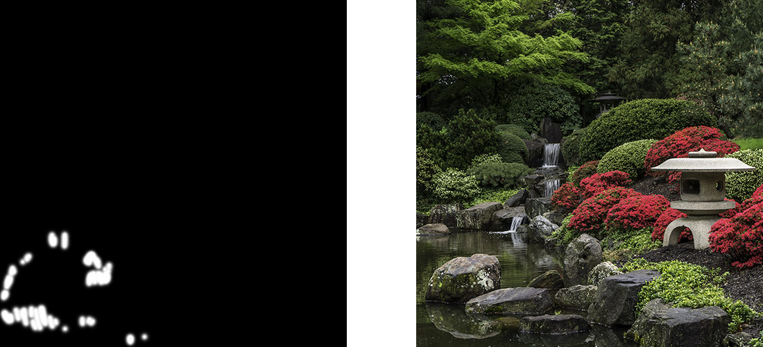
As you can see from this screenshot of the layers panel from a recent photo, I rename my layers so I know what they do in case I do need to go back and make changes at a later date.
Masks
Masks allow you to target your edits to specific sections of your image.
If you look at the photo of my layers, you can see small black and white squares on several of the layers. These are the masks. Where the mask is white, your change will take effect in your photo. Where the mask is black, the change doesn’t affect your photo.
An easy way to remember this is “Black conceals, White reveals.”
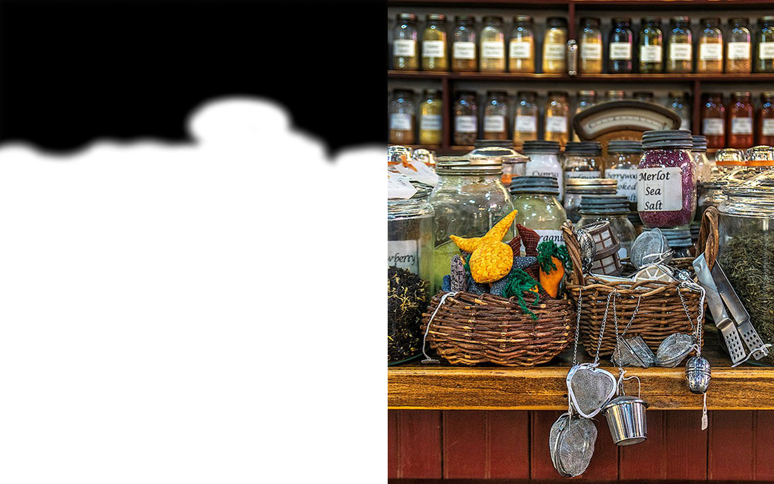
Here’s a photo from the Herb Shop at the Central Market in Lancaster, Pennsylvania after my initial edits. The background shelves were too bright so distracted from the foreground when seemed too dark.
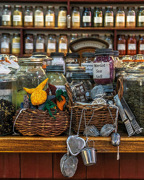
So I used a curves layer to darken the entire photograph by the amount I wanted to darken the background. I then applied a mask where the white area covers the shelves in the background that were too bright so they would be darkened. The rest of the photo isn’t darkened since it was protected by the black area of the mask. 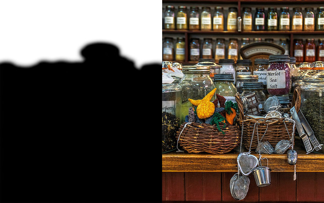
Then I used another curves layer to lighten the entire photograph by the amount I wanted to brighten the foreground. I then applied a mask where the white area covers the foreground of the photo that was too dark so this area would be lightened. The shelves in the background aren’t brightened in this new layer since the area was protected by the black area of the mask.
As you can see, using layers and masks in Photoshop allow you to make non-destructive edits to your photo, and control exactly what areas of your photo you want to be affect by a specific set of changes.
If you’d like to learn more about the power of Photoshop’s layers and masks, join me on October 12-13 for my Photoshop Layers and Masks Workshop. More information about the workshop is available at https://beautifulflowerpictures.com/store/photoshop-layers-masks-workshop-october-2019/
by hankinslawrenceimages | Oct 26, 2018 | Photo Tips, Photoshop, Software
Well – that’s an impressive sounding title! What it really means is I’m going to share the step by step edits I made on my In the Shofuso Japanese Garden photograph.
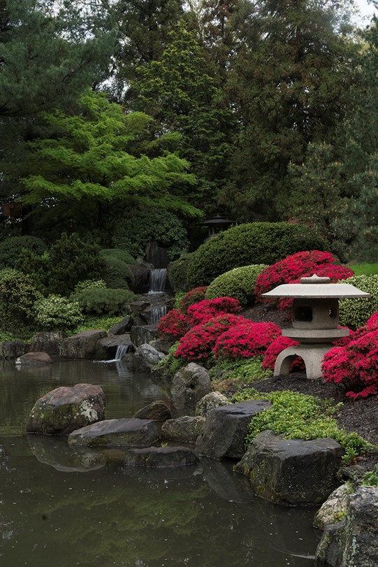
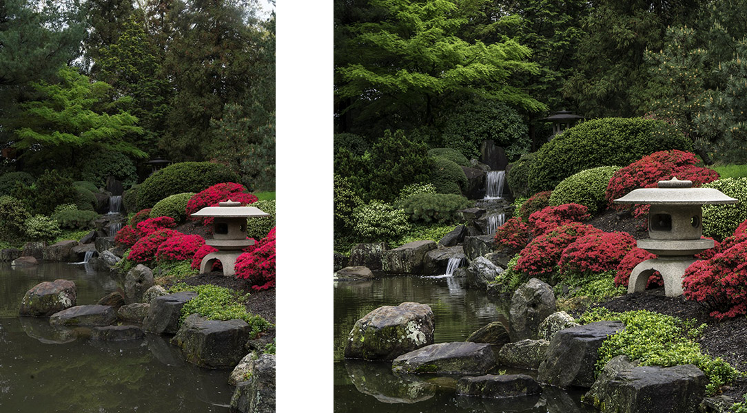
On a visit to Shofuso Japanese Garden in Philadelphia I was captivated by the scene in front of me. I saw a line of water and the waterfall leading my eye to the temple in the trees. I saw azaleas and another small temple on the right framed by the water on the left. And finally, I saw the wonderful bright greens of spring.
Here’s what my camera captured.
The first edits I made were done in Lightroom – where I cropped the photo to a square format and did some global adjustments (changes that affect the entire photograph) to brighten up the photo and increase the contrast just a bit.
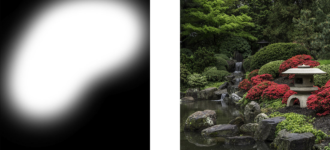
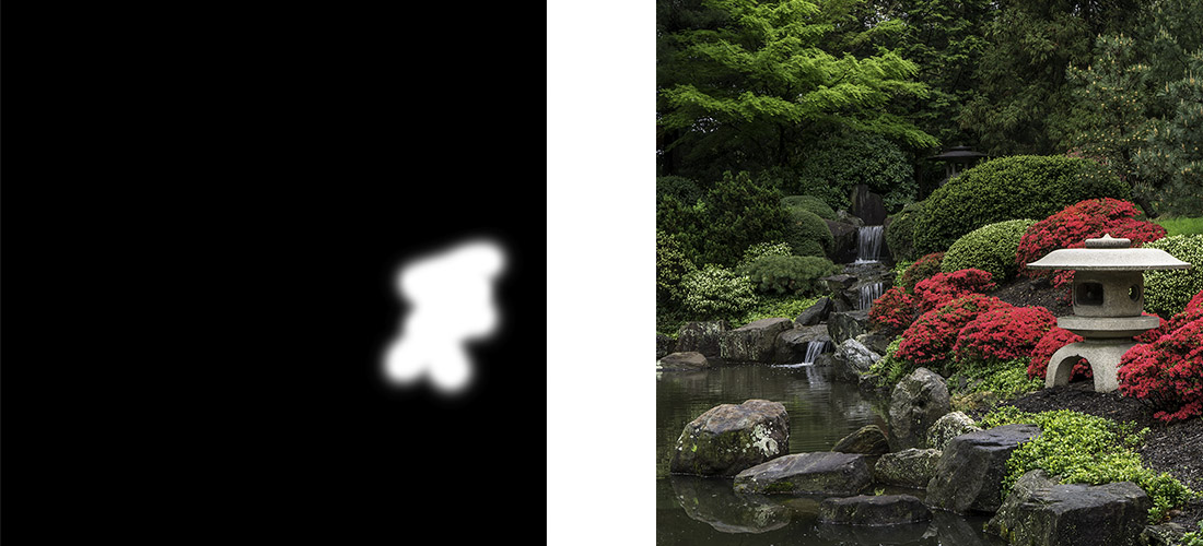
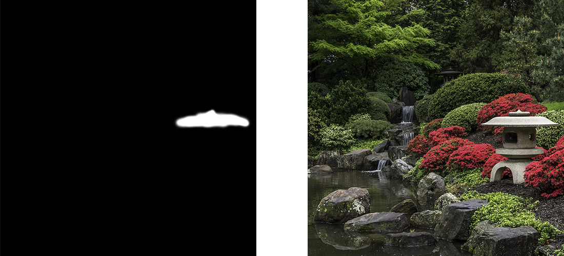
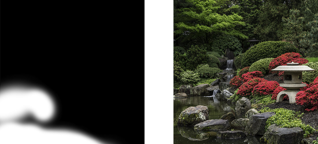
And then I headed into Photoshop to make a series of local adjustments (changes that affect just part of the photograph) tto draw your eye through the photograph so you saw what I saw that day in the garden. I used a series of layers and masks to make the local adjustments. I’m including screenshots of the masks so you can see just what part of the image I’m working on. In Photoshop, a mask allows you to choose where in your photo you want a change to apply. In white areas of the mask – the change is seen. In black areas of the mask – the change doesn’t affect the photograph.
My first change was to use a curves layer to brighten up the background. The background just too dark before I brightened it up
Next I used a curves layer to brighten the front temple. As I looked at the photo, the front temple felt like a dark heavy object in the photo and I wanted to lighten it up a bit.
Followed by another curves layer to darken the top of the front temple. Once I made the changes to temple in the previous step, the top of the temple was too bright and drew my eye away from the water, so I darkened it down a bit.
The next curves layer increased the contrast in the water. One of the things that really attracted me to the scene was reflection of the trees in the water, highlighting the beautiful greens of spring. By increasing the contrast in the water, I could bring out the reflection.
An then a curves layer to brighten the waterfall. As I took the photograph, I saw a line of water leading from the front of the scene, back through the reflections, up the waterfall to the back temple. By brightening up the waterfall, I can help you see the same line.

And another curves layer to brighten up the back temple. The leading line I saw ended at the temple in the back. In the photo, after I had brightened up the water, the temple was getting lost in a dark spot.
And yet another curves layer to brighten the reflections in the water. I love seeing that wonderful shade of yellow green in the spring, and I saw it reflected in the water at the garden. By brightening up parts of the reflection, I could share that same shade of yellow green with you.
Followed by a hue/saturation layer to tone down the reds in the azaleas. With all the adjustments I’d made, they were just a little too bright. I didn’t need to use a mask on this step since the only reds in the photo are the azaleas so my change to the reds didn’t affect the rest of the photo. If there had been other reds in the photo that I didn’t want to tone down, I would have made a mask and just had the change affect the azaleas
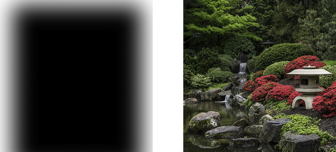
And finally a last curves layer to add a vignette to the photograph. I wanted to darken down the edges and corners to draw your eye into the center of the photograph.
My last step was just to do a little sharpening on the photo. Since I photographing in RAW mode, no sharpening is applied when I capture my image, so I need to add a bit in at the end.
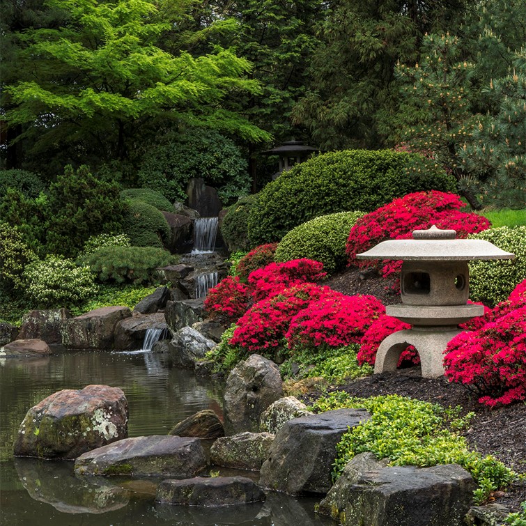
As you look at my initial capture and my final image, you can see how I used a series of small local adjustments to draw your eye into the photograph and follow the leading line from the bright reflection in the water, up the waterfall to the temple in the back. And also you can see a balance in the photo between the red azaleas and temple on the right side of the photo and the water and waterfall on the left.
My hope is that my final image allows you to see the same beautiful scene that I saw at the gardens that day.
How I edited this photograph is one of the examples I share in a talk “The Power of Local Adjustments” that I have available for presentation to camera clubs and photography groups. If you belong to a camera club or other group that might be interested in having me speak about photography and photo editing, please drop me a note. I’d love to come speak to your group.
And if you love my photograph of the Shofuso Japanese Garden, it is available on my website at https://beautifulflowerpictures.com/store/shofuso-1/
by hankinslawrenceimages | Mar 23, 2018 | Photoshop, Software, Workshops
I often get asked how much and what do I do when I edit my photos. My answer is always – I do what I need to in Lightroom and Photoshop to show you in my final photo what I saw and felt.
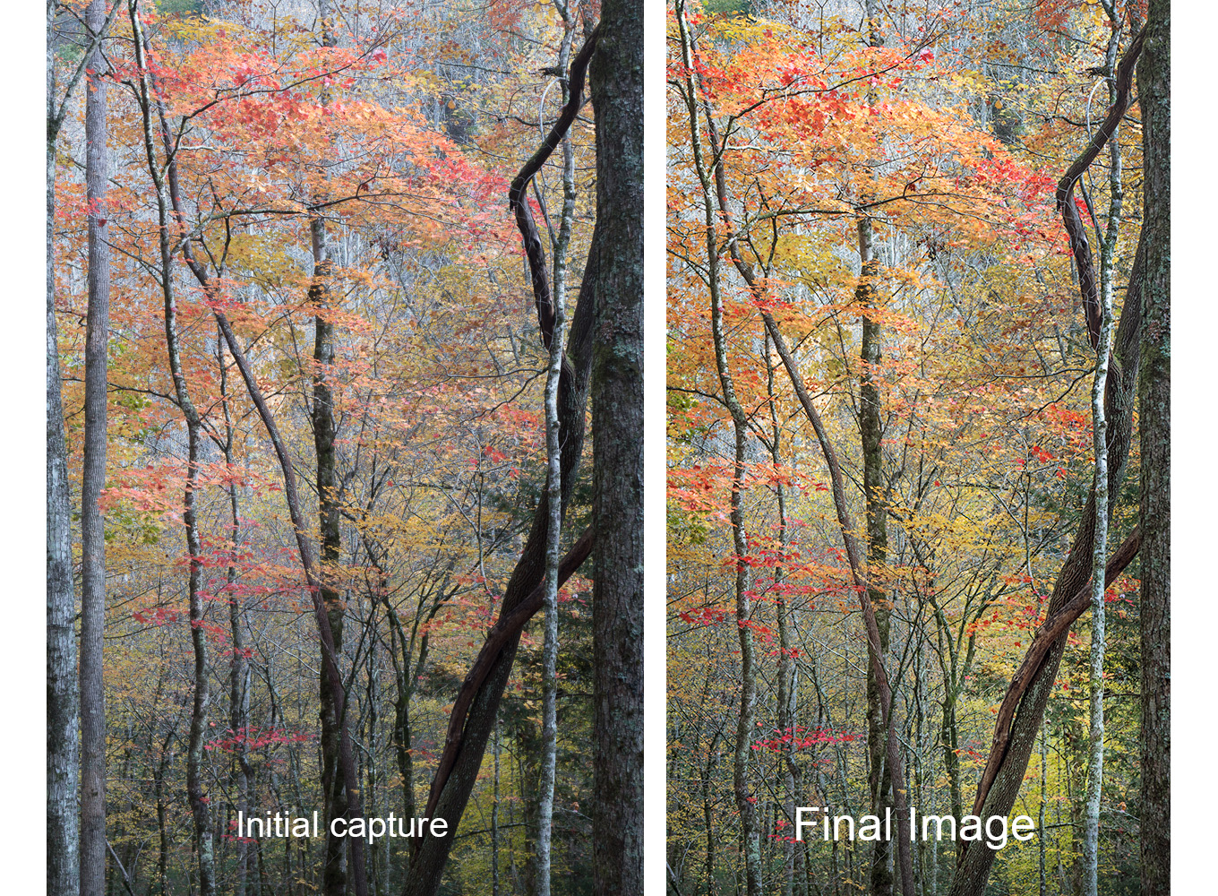
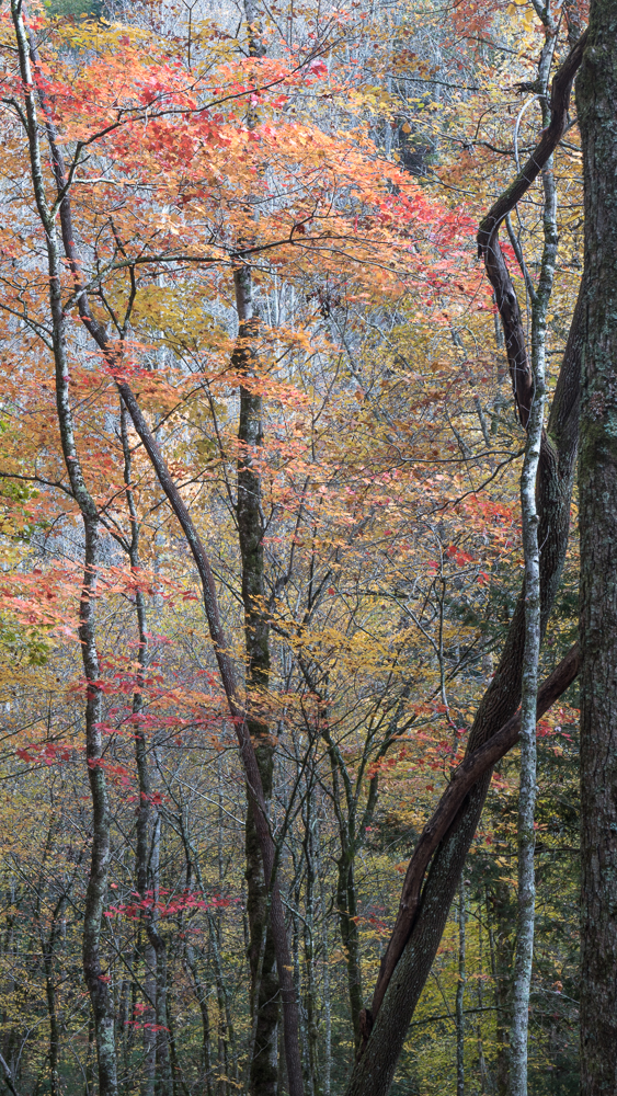
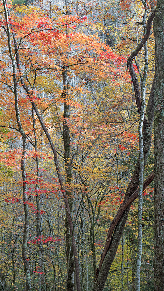
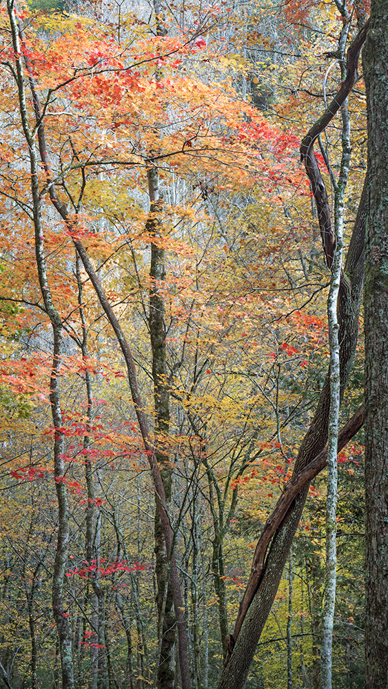
Today, I thought I’d take you through my editing process and show you how I’ve edited one of my fall color photos from last fall’s trip to the Smokies from start to finish.
I was photographing fall color along River Road in the Great Smoky Mountains National Park. All week, the lighting conditions had been a little challenging – clouds, then bright sun, then lots of contrast, then less contrast – so I just set my camera on auto bracket to capture three exposures of each image in case I needed to merge multiple images to properly capture the scene.
What caught my eye in this scene was the light coming down through the leaves highlighting the beautiful reds, oranges and yellows.
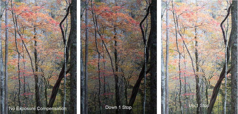
So I took my camera out of my backpack and set up my tripod. I captured three images – at ISO 100, f 11 – one photo at the normal exposure, one photo a full stop down and one photo a full stop up.
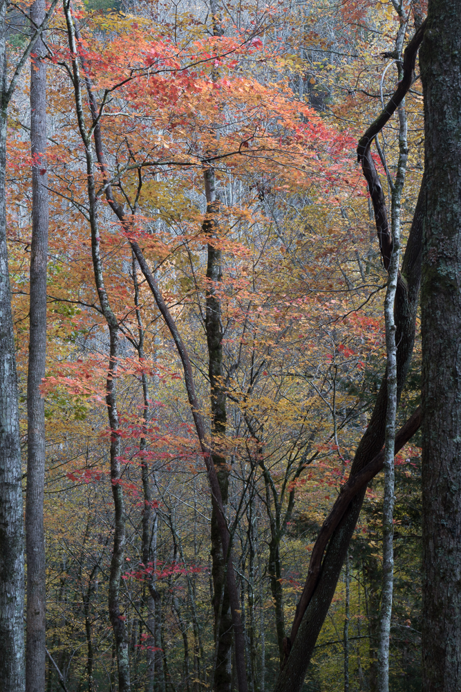
Looking at the three images, I decided to merge them using Lightroom’s HDR merge function to give me one image with a greater dynamic range than any of the three individual photos.
Then in Lightroom I did some initial edits – cropped the photo to a 16X9 aspect ratio and made some changes in the Basic Panel of the Develop module adjusting Highlights, Shadows, Blacks, Whites and Clarity (mid-tone contrast). My goal was to have a well-exposed file to take into Photoshop.
Once in Photoshop, I made my next set up of edits. I opened up the shadows on the lower third and right hand side of the photo to lighten the trees and woods in the foreground. I then took some blues out of the entire photo to warm it up – photo felt cool to me and I wanted to share the warm colors I saw in the woods. And then finally I added a little bit of saturation to the red and yellows leaves to make them stand out a bit more.
Now that I’d completed my first set of edits, I printed a copy and Bill and I took a look at it. I’ve found it really helps to have someone else review my prints as I’m working on a photo. Bill often sees things that I don’t see – since I took the photo and know what I want it to look like – whereas he is looking at it with fresh eyes.
As Bill and I looked at the photo, we realized that it looked flat and didn’t reflect the light coming through the trees that had caught my eye in the woods. So I brightened the leaves and woods from the upper left corner of the photo down towards the lower right corner to draw your eye into the photo and into the woods. I also brightened up the white and gray bark on the narrow tree along the left side of the photo to bring your eye that direction. Finally, I added a vignette to the photo to draw your eyes away from the edges and towards the center of the image.
So I ran another print and thought the photo looked really good. And then I left it sitting on the printer for a few days, knowing that sometimes we’ll see something else that needs done once we’ve walked away from the photo and then come back for another look.
When Bill and I went back and took another look – we realized that the lighter greens in the lower right corner of the photo were still a little flat. So I brightened up those yellows and greens just a bit with a curves layer. And ran another print.
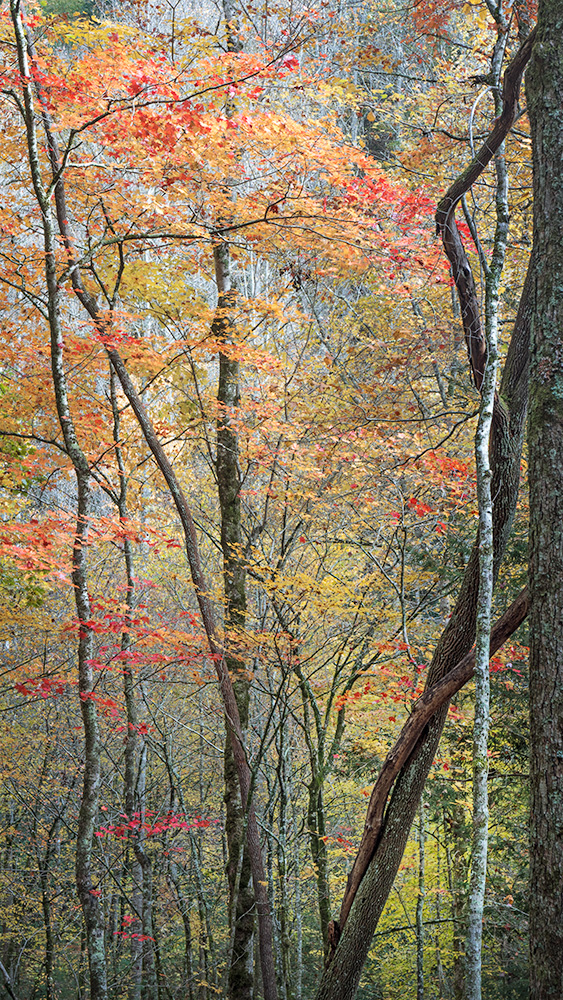
And this time, we decided the photo was done . . . unless I decide to make some more edits at a later date.
Here are the initial capture and final image side by side.

My hope is that the final image shares the beauty I saw in the woods last fall with you.
If you’d to learn more about how Bill and I approach editing our photos, join us for our Making Your Photos Look The Way You Want Them To Look Workshop on April 14. We’ll share more details about our editing workflow and help you develop an approach to editing your photos that works for you. You can read more about the workshop at https://beautifulflowerpictures.com/making-photos-look-way-want-look/
And if you have any questions about my approach to editing,leave a note in the comments below and I’ll try to answer them in a future newsletter.

by hankinslawrenceimages | Jan 7, 2015 | Photoshop, Software
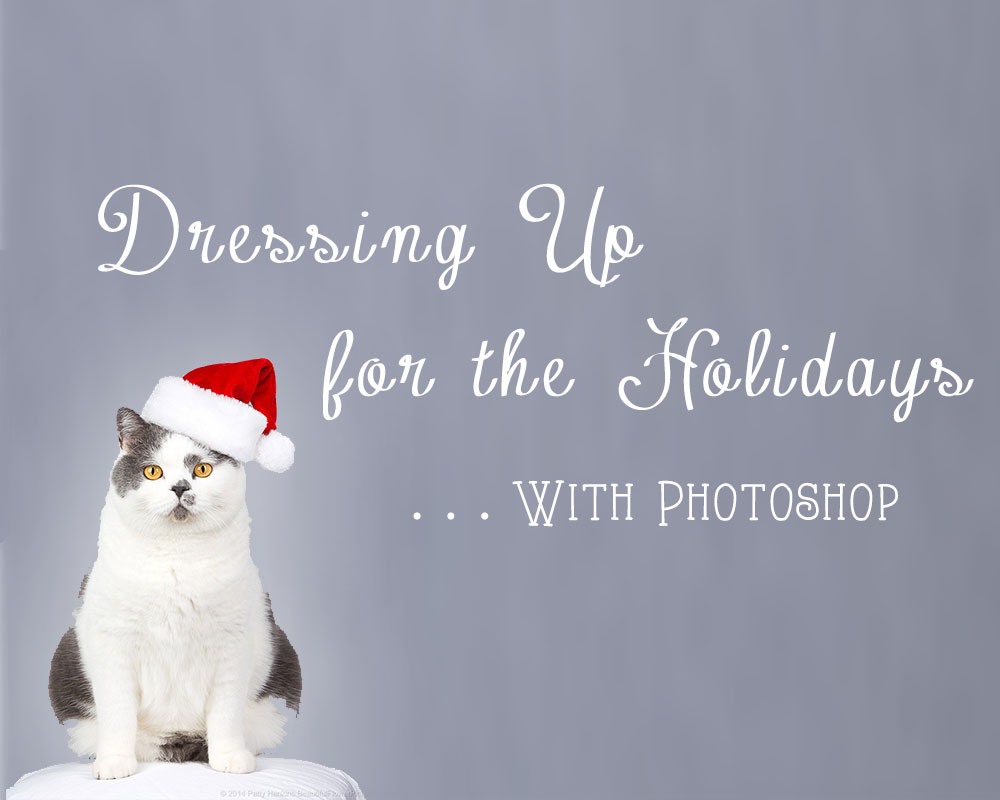
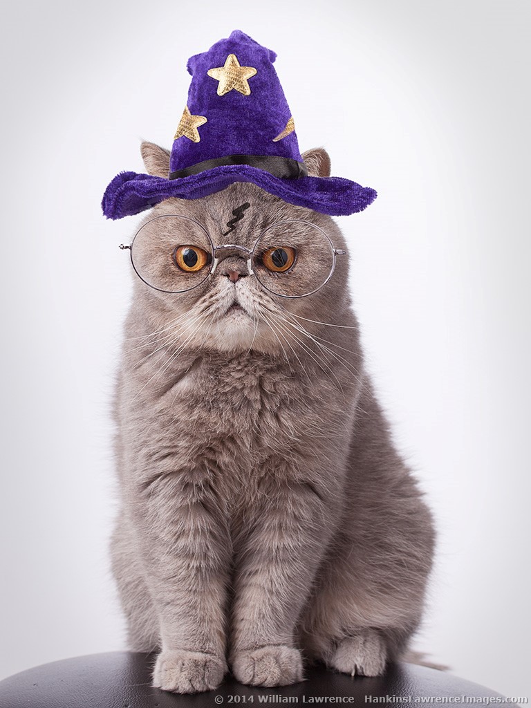
Whether its Kitty Dusty dressed up as Harry Potter or Kitty Ansel in his Santa hat, every time I post a photo of any of our cats dressed up for the holidays I always get asked “How do you do that? How do you get the cats to wear the hats and pose for you?” The secret is – we don’t!
Bill and I did try putting hats on the cats in the past for their photos – we never got any good photos. But we did really annoy the cats (and occasionally have to patch up a bleeding photographer). So we figured out how to do it in Photoshop (you may also be able to do this in Photoshop Elements – we don’t have a current version so couldn’t check to see if it would work.) With a little practice – you too can dress your fur-kids up for the holidays.
The main Photoshop techniques we use are extracting an object using the “quick select” and “refine edges” commands, and resizing an object using the “free transform” command. We’re not going to go into step by step details on how to use them. Great info on both can easily be found on the web (how do you think we learned how to do this?).
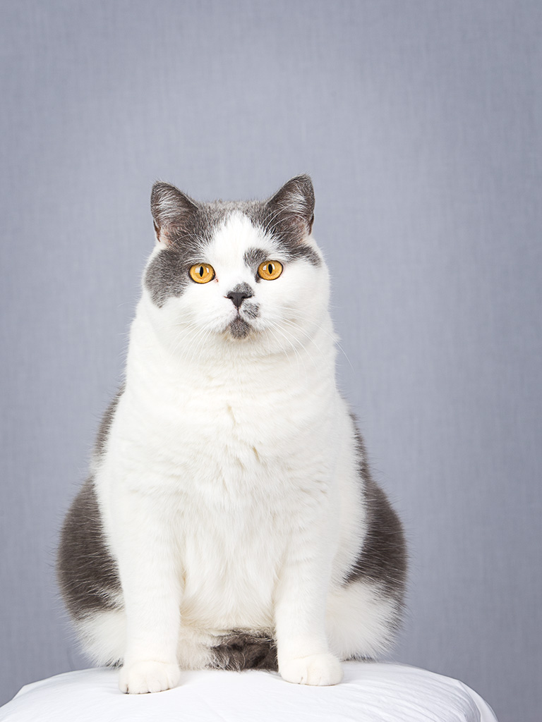
First, we start with a picture of our model, Kitty Ansel. Ansel loves to pose on the posing stool, making this part easy. For those interested, we used a strobe with softbox on camera left, and one with a strip light camera right, set about 1 stop below the main light. Before we had studio lights and such, we put a sheet on the wall for background in a room that had enough window light to photograph the cats.
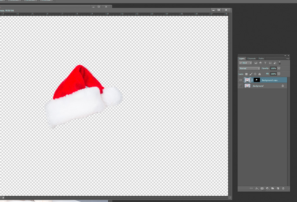
Next, we use a Teddy bear to photograph the Santa hat in the same light we used for Ansel (this makes the combination look more realistic).

Using the “quick select” tool (located in the same box as the “magic wand” tool, Bill roughly selected the Santa hat, and used the “refine edge” button to refine the selection. He set the refine edge to save the selection as a new layer with layer mask. This gives you a layer showing just the Santa hat.
Now with both the cat photo and the Santa hat photo open, drag the hat layer from the hat file to the cat photo.
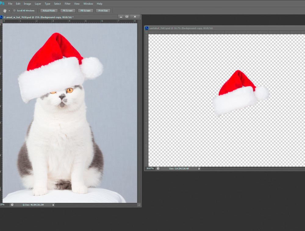
This gives you a hat on top of the cat, although the size and the angle are wrong. The “free transform” tool (Ctrl-T in windows) with the hat layer selected will let you rotate the hat, and change the size so that you can create a hat that fits the cat. To make the combined photo more realistic, Bill used a little darkening curve masked to show under the hat to give the appearance of shadow immediately under the hat.
The final result:

A wonderful photo of Kitty Ansel wearing his Santa hat and no photographers were harmed (or had to visit the ER) in the creation of the photo!