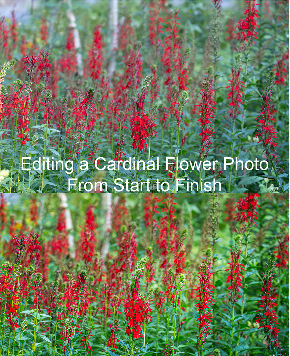
After my last newsletter on why I use Photoshop’s Layers and Masks, I had a few questions about how I use them. So I thought I’d go through the edits on my new Cardinal Flowers photograph in step by step detail.
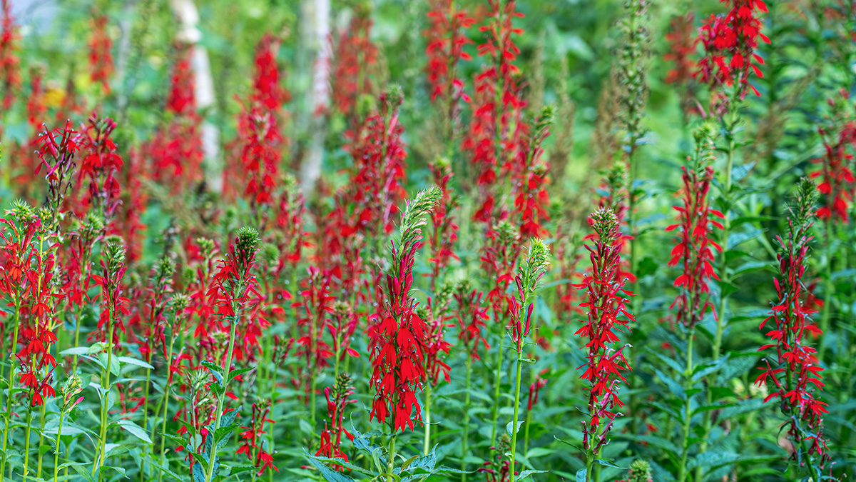
I took the photograph at a local garden earlier this summer. As I walked through a wooded area, I saw a spectacular group of red cardinal flower plants (Lobelia cardinalis) in the green of the woods. In addition to the contrast of the bright reds and greens, there was a tree with white bark that added a nice element to the background of the photo. I knew as I photographed it that I would edit it as a panoramic photograph to give the sense of being among all the cardinal flowers.
The photograph was taken with my Sony A7III camera and my 24-105 lens at 105mm. My settings were ISO 100, aperture of F 4.5 (for a shallow depth of field to blur the flowers in the background), shutter speed of 1/15 of a second. I had my camera on my tripod when I took the photo.
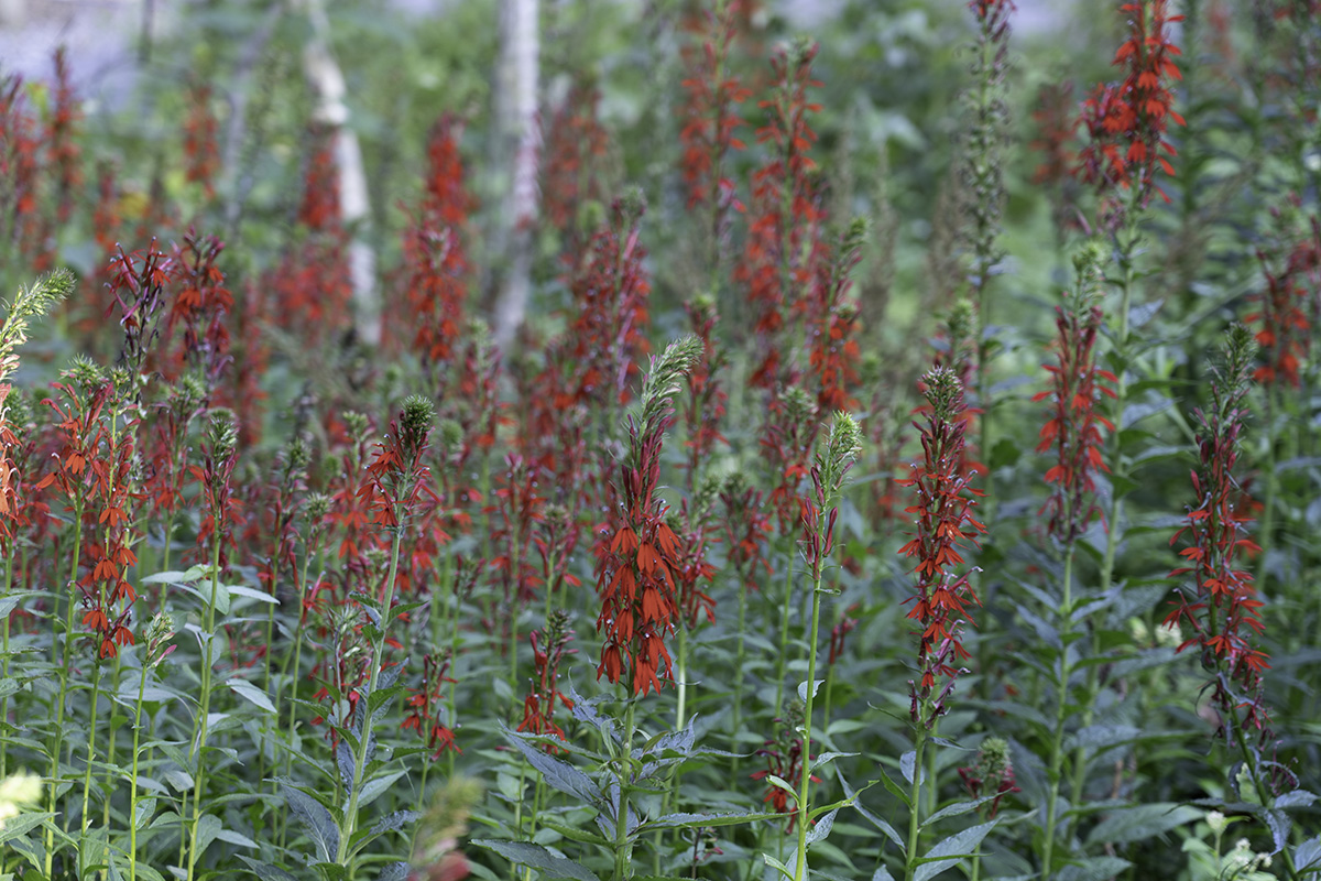
Here is the my initial unedited capture.
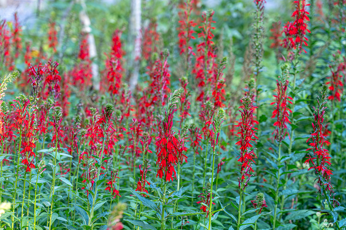
In Lightroom, I made some basic adjustments. I applied the Lens Profile Correction for the 24-105 lens. And made a few adjustments in the Basic Panel: Highlights -100, Shadows +100, Whites +40, Blacks -21, Texture +26 and then exported the photo into Photoshop to start my editing. Here’s my image after the adjustments in Lightroom
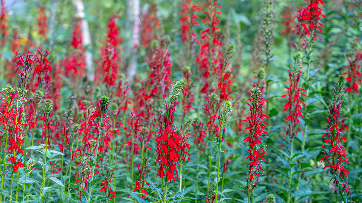
Once I got the image into Photoshop, I cropped it to a 16 X 9 aspect ratio, did a little cleaning up around the edges and used Topaz’s DeNoise AI with the AI Clear option to remove any noise in the image. Here’s the cropped, cleaned up and denoised image.
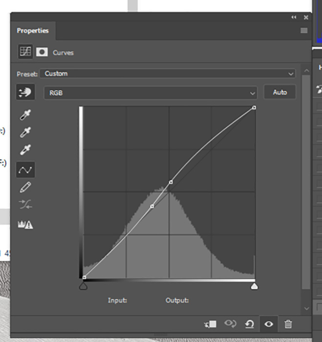
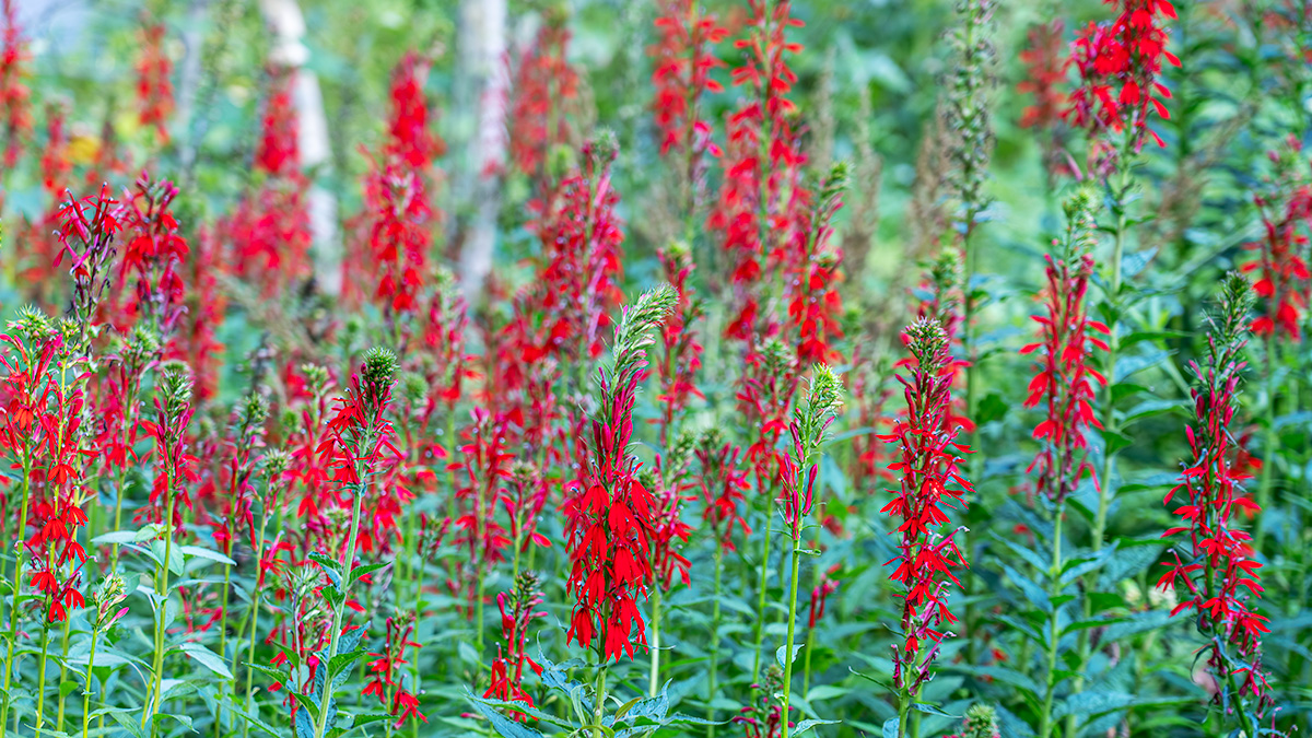
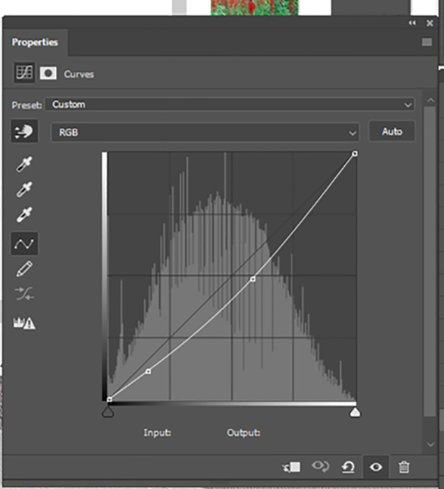
Now it was time to start editing. The first adjustment layer I used was a curves layer to add a little more contrast in the image. Here’s the curve I used and the image with the curve applied.
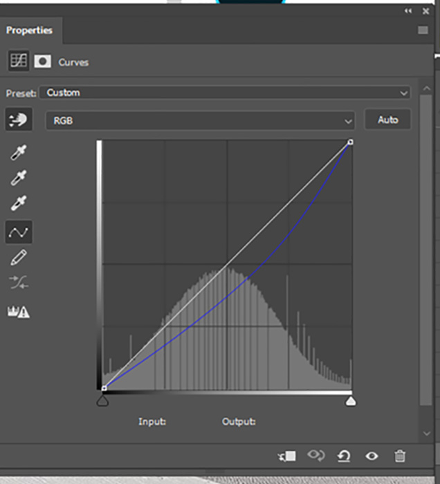
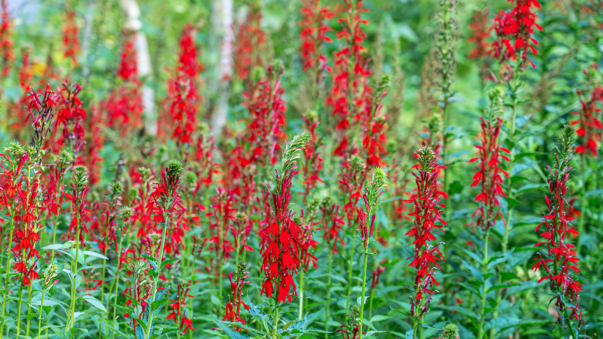
Next I used another curves layer to decrease the amount of blue in the image. Often times photos taken in gardens or woods with lots of greens have too cool of a look for my taste, so removing some blue warms up the image and brings it closer to what I remember seeing. Here’s the curve showing the changes in the blue channel and the image after the curve was applied.
At this point, I ran my first test print. Things looked pretty good on my monitor – not so great in the print. The reds weren’t printing correctly (they were right at the edge of the colors my printer can print) and I wasn’t clearly drawing the viewer’s eye to where I where I want people to look in the image.
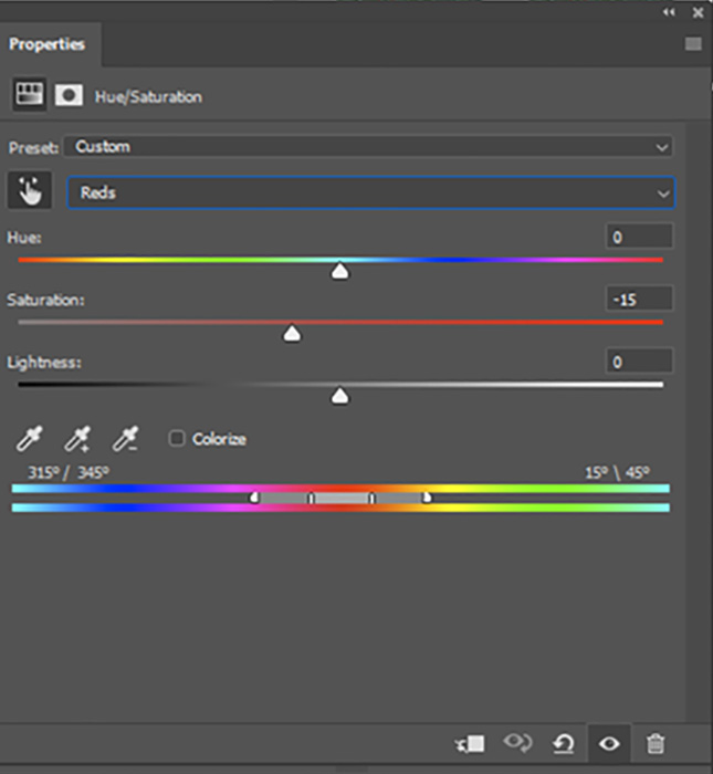
So I used a Hue/Saturation layer and adjusted the reds in the image. Here’s are the settings I used and the image after I desaturated the reds.
My next step was to use a curves layer to darken the overall image and a mask to turn the adjustment into a local adjustment that affected everything except the flowers in front. That way, your eye would go to the brighter area of the photo first. Here’s the curve I used, the mask and the adjusted image. Remember, when using a mask, White Reveals – Black Conceals – so the change only affects the parts of the image covered by the white areas of the mask.
I then used a Hue/Saturation layer adjustment layer to desaturate and darken the photo except again for the masked flowers in the front. These changes help draw your eye to the front flowers that are now the lightest and most saturated part of the image. My Hue/Saturation settings were: Reds -5 saturation -14 lightness, Yellows -12 saturation -6 lightness, and Blues -3 saturation. Here is the mask I used to control which areas of the photos were affected by the changes and the photo after the darkening and desaturation.

I then made a Stamp layer and used the Camera Raw Filter to add a vignette around the edges to help draw the viewer’s eye in from the corners and into the center of the image.
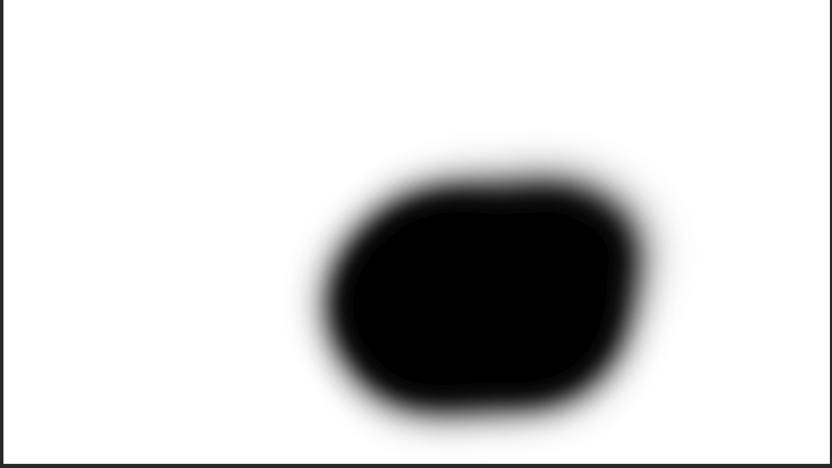
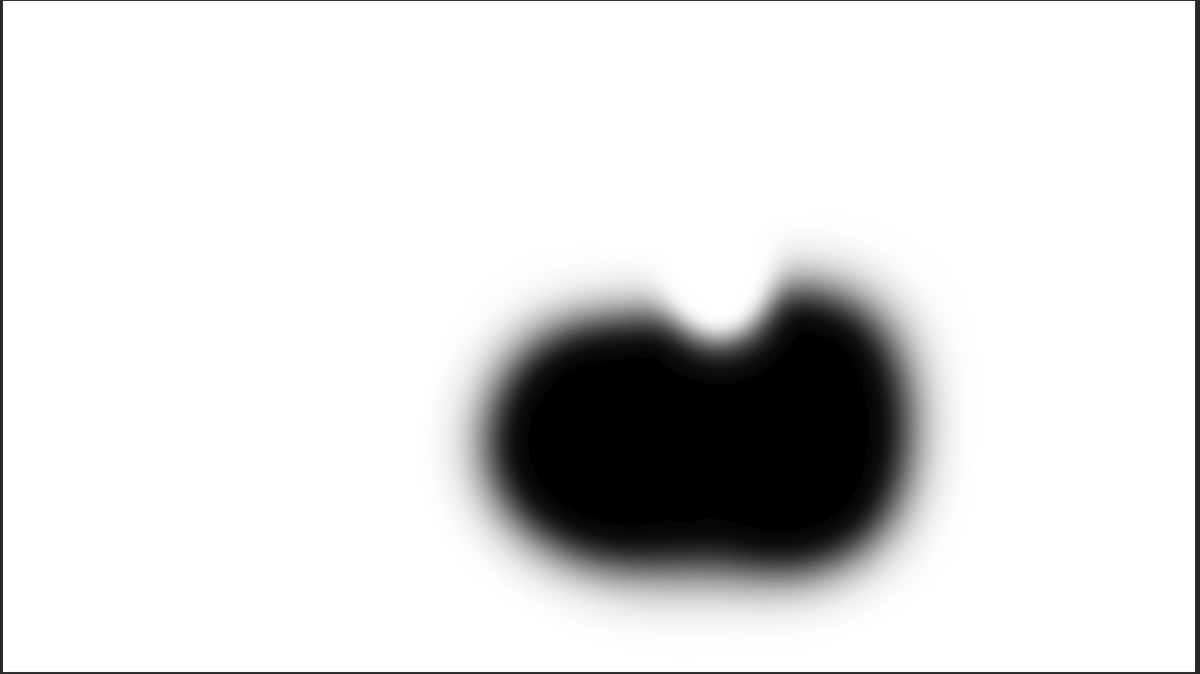
At this point I sharpened the image and ran a print. When I evaluated the print I was happy with everything except the overall sharpness of the photo. I wanted a little more of a blurred feeling in areas other than the front flowers to increase the sense of depth in the photo. So I added a mask to my sharpening layer so only the front flowers are sharpened to draw your eyes to them. This is the mask I used for the sharpening layer.

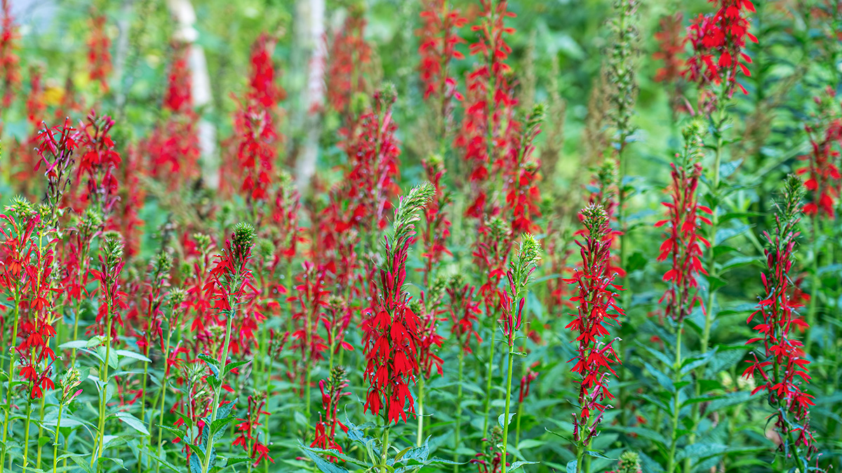
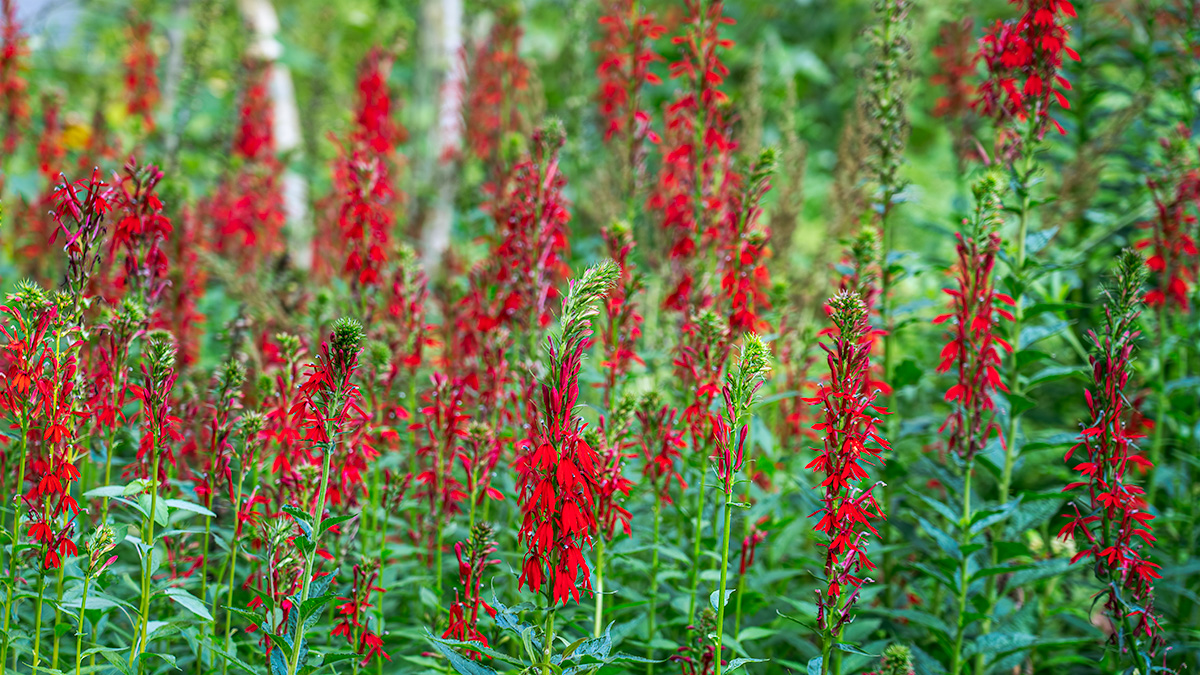
And my final image

What my edits were intended to do was take the photo from a nice scene of cardinal flowers in the woods with no real focal point
To an image where the viewer’s eye goes straight to the flowers in the front – they are the brightest, most saturarted and sharpest section of the photograph.
If you’d like to learn more about how I use Photoshop’s Layers and Masks and how you can use them to share your vision for your photographs, please join me for my Photoshop Layers and Masks Workshop on October 12-13 at my home in Bethesda. The workshop is limited to 4 students to ensure you get the personalized assistance you need.
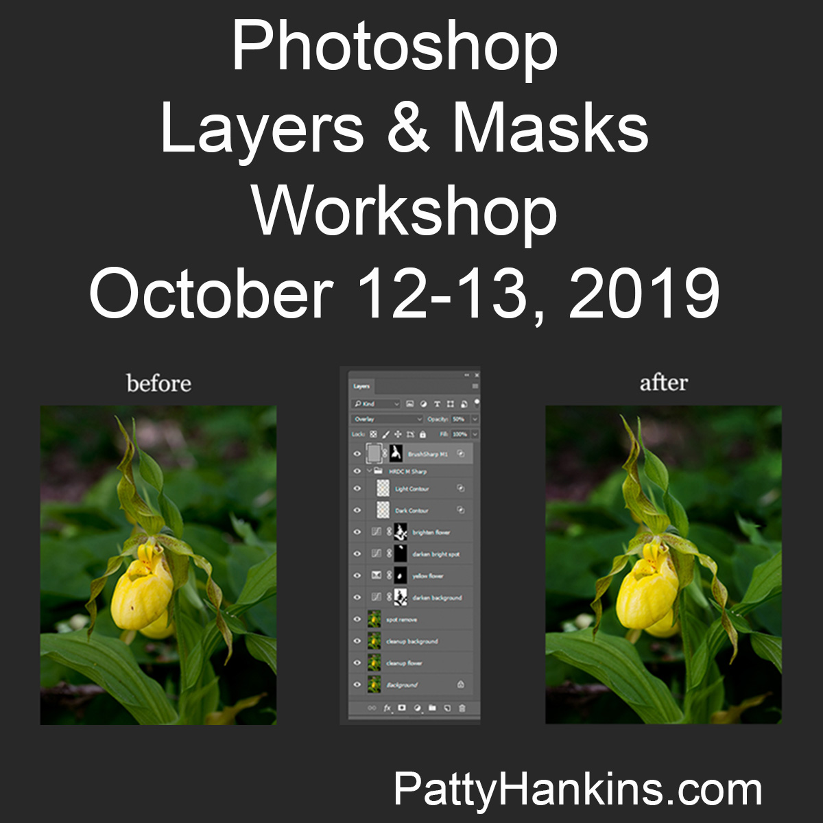
You can read more about the workshop and register at https://beautifulflowerpictures.com/store/photoshop-layers-masks-workshop-october-2019/