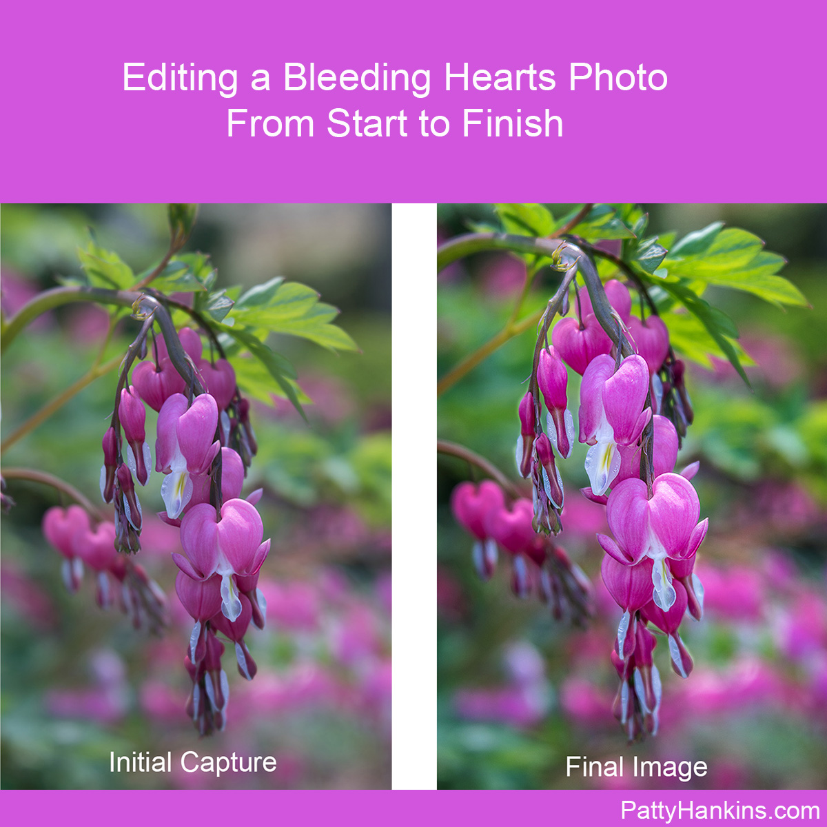
by hankinslawrenceimages | Feb 5, 2020 | Photo Tips
A couple of months ago, I shared how I edited one of my landscape photographs from start to finish. Several people asked me shortly thereafter how do I edit my flower photographs? And do I do it differently than I edit my landscape photographs.
The answer is – I don’t really have a “standard” set of edits that I do on my photographs. Instead, I make the edits I need to share with you what I saw and felt when I captured the image.
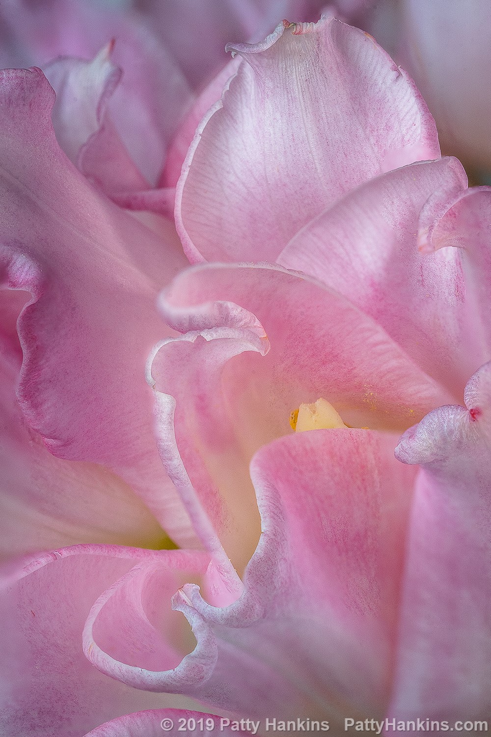
So today I thought I’d take you through how I edit one of my bleeding heart photos from start to finish. I captured the photograph earlier this month at Longwood Gardens. What caught my eye was the group of bleeding heart blossoms coming towards me, with all the other blossoms further behind. I knew that if I photographed the scene with everything in sharp focus, the front flowers wouldn’t stand out the way I wanted them to. So for this photo the lens I pulled out of my pack was my Lensbaby Velvet 56 which is designed to be a soft focus lens which I knew would give me the lovely blurred background I was looking for.
The settings on my Sony a6500 were ISO 100, 1/200th of a second for my shutter speed and probably f 4 for my aperture. The Lensbaby Velvet is a manual lens so my camera doesn’t record data for the aperture. My camera was on my tripod for the photo.
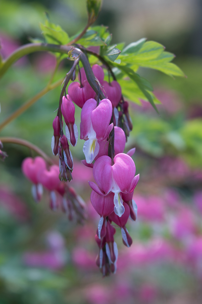
Here’s my initial capture for the image. While the composition was close to what I wanted to share, the colors didn’t reflect what I saw on a that bright sunny day in the gardens.
Then in Lightroom I did some initial edits making some changes in the Basic Panel of the Develop module adjusting Highlights, Shadows, Blacks, Whites and Clarity (mid-tone contrast) and applying a correction for distortion added by the lens. My goal was to have a well-exposed file to take into Photoshop.
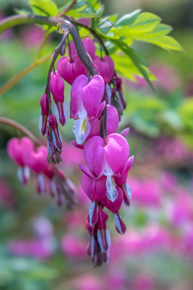
Once I had my image open in Photoshop, I made my next set of edits. I cropped the image a bit, keeping the same aspect ratio, to emphasize the front flowers. Next, I ran a high pass filter to add a bit of contrast/sharpness around the front flowers to help them stand out. I then used a pair of curves layers to darken the background a bit, and to brighten up the front flowers. Finally I added a vingnette to draw your attention into the center of the image.
Now that I’d completed my first set of edits, I printed a copy and Bill and I took a look at it. I’ve found it really helps to have someone else review my prints as I’m working on a photo. Bill often sees things that I don’t see – since I took the photo and know what I want it to look like – whereas he is looking at it with fresh eyes.
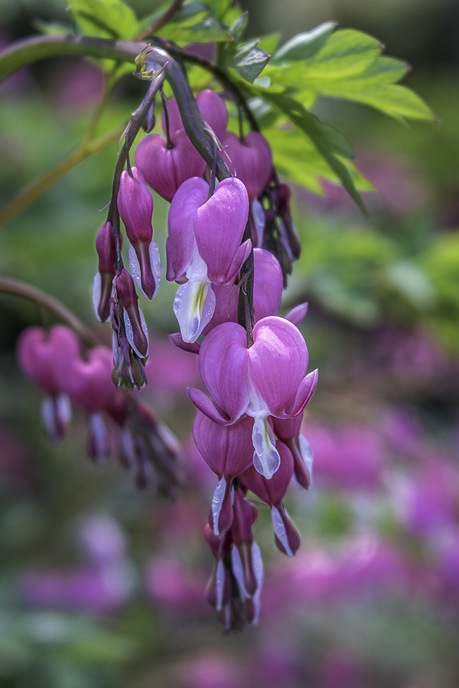
Overall, while the image on the monitor looked great, the print looked flat and boring. The problem was the pinks just didn’t look quite right. It turns out that the many of the shades of pink in my image were outside the gamut of printer – in other words – my printer couldn’t print the colors in my photo accurately so it printed them all the same shade.
So I had to make some changes to the photo to bring the pinks to a color I could print on my Epson 3880 printer. The first edits I made at this point were to darken the front flowers a bit which changed the shade of pink a bit. Then I went into the Magentas in a Hue/Saturation layer and darkened then a bit. Finally, I used a Color Balance layer to decrease the overall amount of magenta in the image by adding a bit of green. And then I ran a new print.
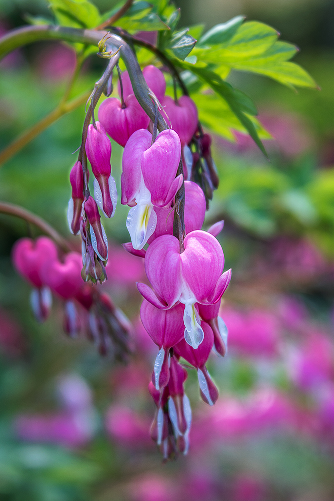
When we took a look at this second print, most of the shades of pink were within the printer’s print gamut so the photo looked much better. Some tones still weren’t printing the way I imagined they would look, but they were close. And my only options were to present it as it was, made more changes to get the pinks into gamut but then the rest of the photo didn’t look right, or invest a new printer with a wider print gamut on the chance that it could print a few more shades of pink.
I decide that I was happy with the photo the way it was.
If you’d like to learn more about how I edit my photos in Photoshop, please join me for my Photoshop Layers and Masks workshop on June 6-7. You can read more about the workshop at https://beautifulflowerpictures.com/store/photoshop-layers-and-masks-workshop-june2020/
by hankinslawrenceimages | Sep 20, 2019 | Photo Tips, Workshops
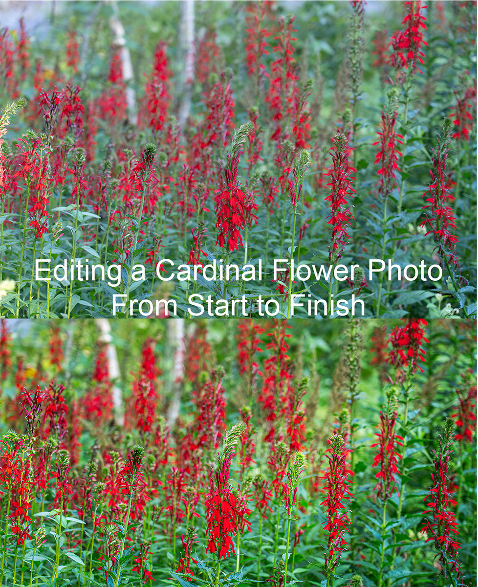
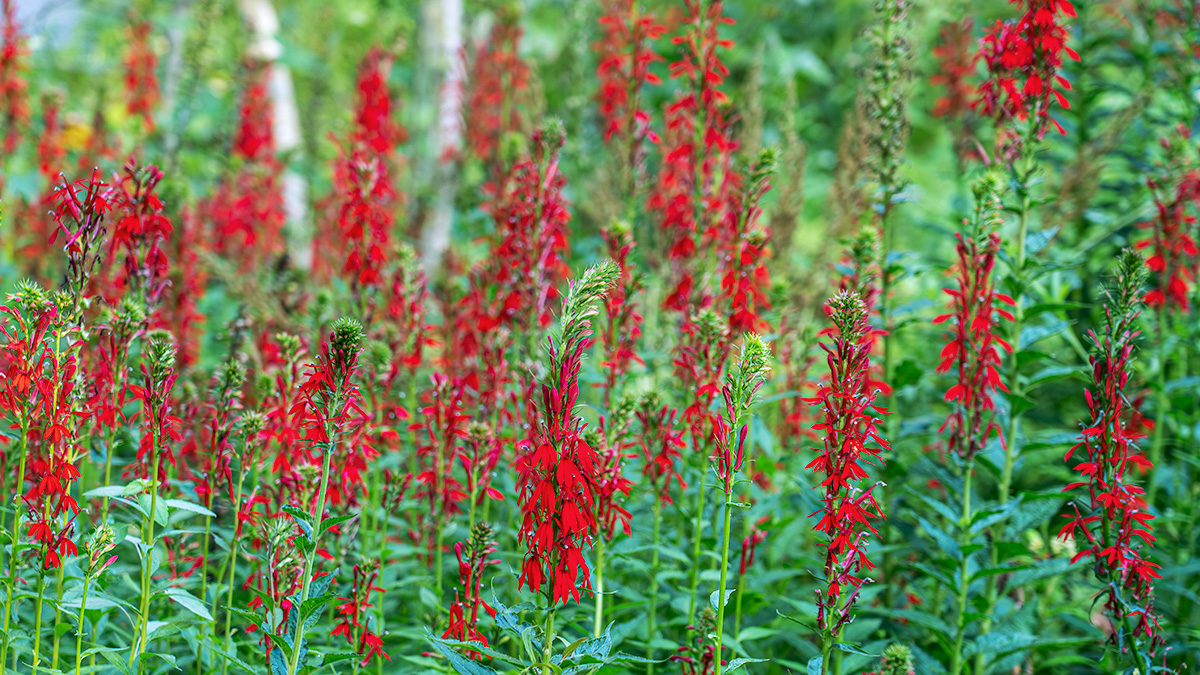
After my last newsletter on why I use Photoshop’s Layers and Masks, I had a few questions about how I use them. So I thought I’d go through the edits on my new Cardinal Flowers photograph in step by step detail.
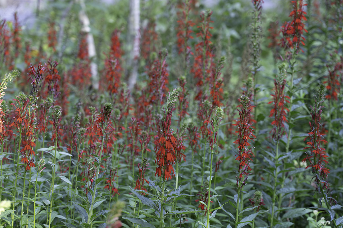
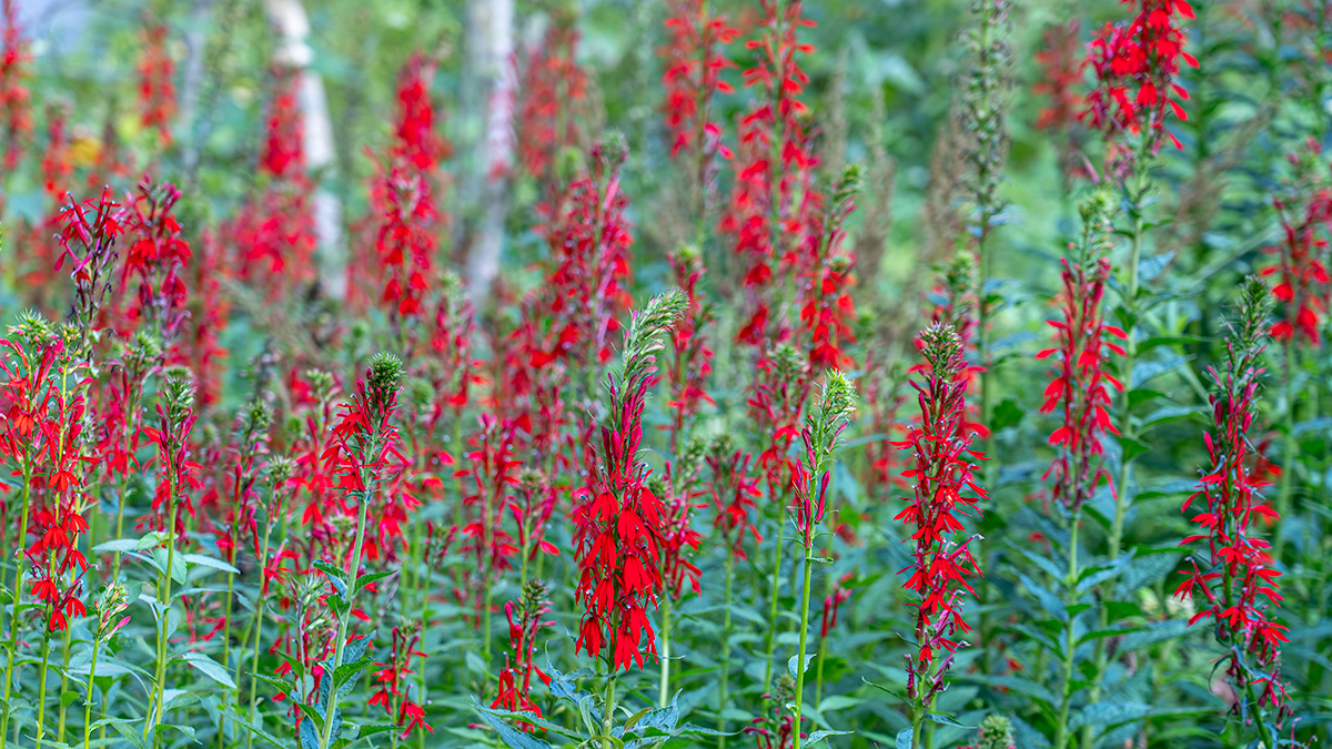
I took the photograph at a local garden earlier this summer. As I walked through a wooded area, I saw a spectacular group of red cardinal flower plants (Lobelia cardinalis) in the green of the woods. In addition to the contrast of the bright reds and greens, there was a tree with white bark that added a nice element to the background of the photo. I knew as I photographed it that I would edit it as a panoramic photograph to give the sense of being among all the cardinal flowers.
The photograph was taken with my Sony A7III camera and my 24-105 lens at 105mm. My settings were ISO 100, aperture of F 4.5 (for a shallow depth of field to blur the flowers in the background), shutter speed of 1/15 of a second. I had my camera on my tripod when I took the photo.
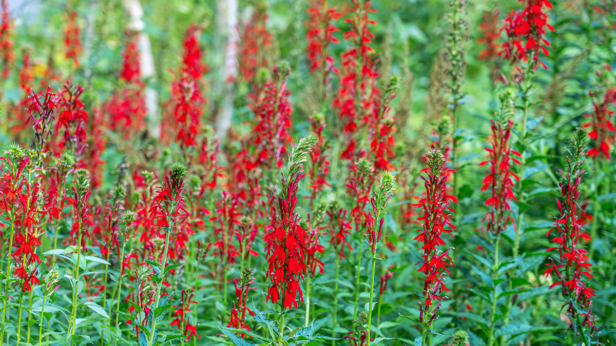
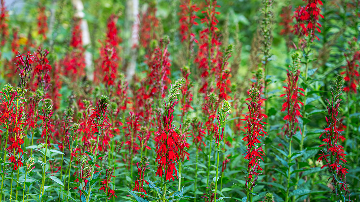
Here is the my initial unedited capture.
In Lightroom, I made some basic adjustments. I applied the Lens Profile Correction for the 24-105 lens. And made a few adjustments in the Basic Panel: Highlights -100, Shadows +100, Whites +40, Blacks -21, Texture +26 and then exported the photo into Photoshop to start my editing. Here’s my image after the adjustments in Lightroom
Once I got the image into Photoshop, I cropped it to a 16 X 9 aspect ratio, did a little cleaning up around the edges and used Topaz’s DeNoise AI with the AI Clear option to remove any noise in the image. Here’s the cropped, cleaned up and denoised image.
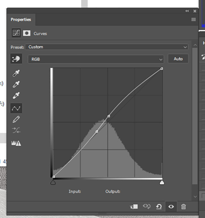
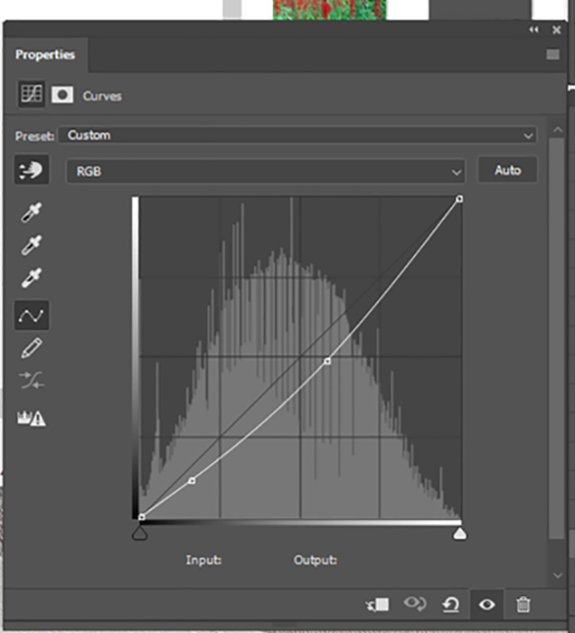
Now it was time to start editing. The first adjustment layer I used was a curves layer to add a little more contrast in the image. Here’s the curve I used and the image with the curve applied.
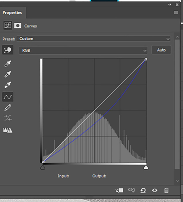
Next I used another curves layer to decrease the amount of blue in the image. Often times photos taken in gardens or woods with lots of greens have too cool of a look for my taste, so removing some blue warms up the image and brings it closer to what I remember seeing. Here’s the curve showing the changes in the blue channel and the image after the curve was applied.
At this point, I ran my first test print. Things looked pretty good on my monitor – not so great in the print. The reds weren’t printing correctly (they were right at the edge of the colors my printer can print) and I wasn’t clearly drawing the viewer’s eye to where I where I want people to look in the image.
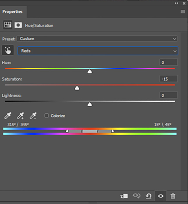
So I used a Hue/Saturation layer and adjusted the reds in the image. Here’s are the settings I used and the image after I desaturated the reds.
My next step was to use a curves layer to darken the overall image and a mask to turn the adjustment into a local adjustment that affected everything except the flowers in front. That way, your eye would go to the brighter area of the photo first. Here’s the curve I used, the mask and the adjusted image. Remember, when using a mask, White Reveals – Black Conceals – so the change only affects the parts of the image covered by the white areas of the mask.
I then used a Hue/Saturation layer adjustment layer to desaturate and darken the photo except again for the masked flowers in the front. These changes help draw your eye to the front flowers that are now the lightest and most saturated part of the image. My Hue/Saturation settings were: Reds -5 saturation -14 lightness, Yellows -12 saturation -6 lightness, and Blues -3 saturation. Here is the mask I used to control which areas of the photos were affected by the changes and the photo after the darkening and desaturation.

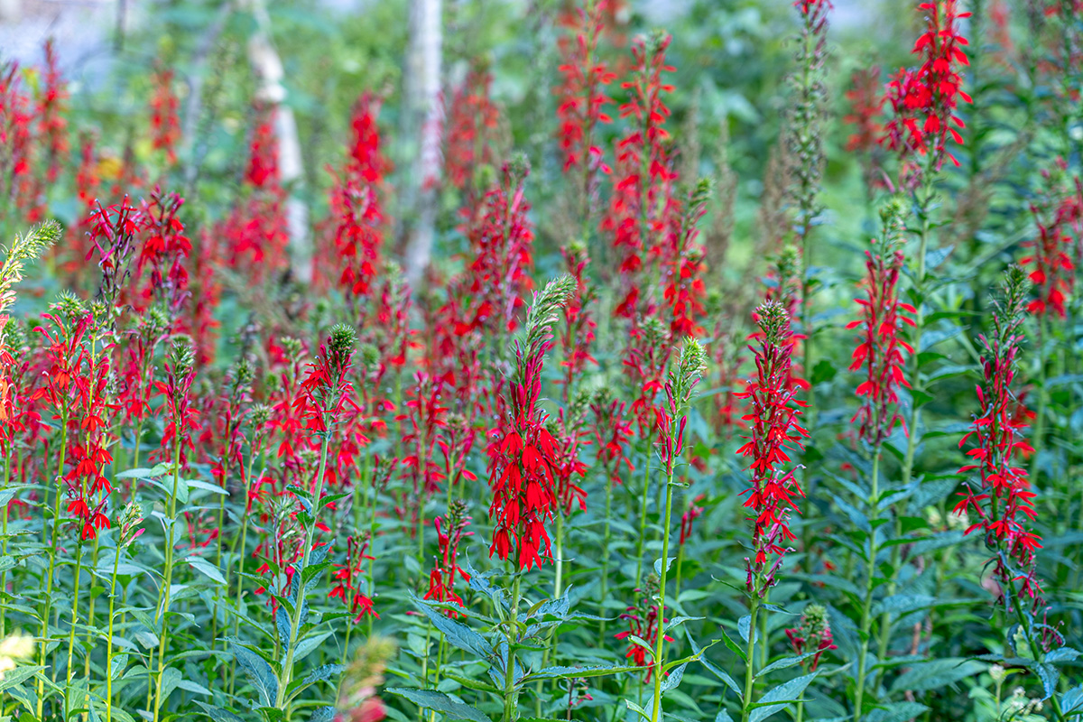
I then made a Stamp layer and used the Camera Raw Filter to add a vignette around the edges to help draw the viewer’s eye in from the corners and into the center of the image.
At this point I sharpened the image and ran a print. When I evaluated the print I was happy with everything except the overall sharpness of the photo. I wanted a little more of a blurred feeling in areas other than the front flowers to increase the sense of depth in the photo. So I added a mask to my sharpening layer so only the front flowers are sharpened to draw your eyes to them. This is the mask I used for the sharpening layer.

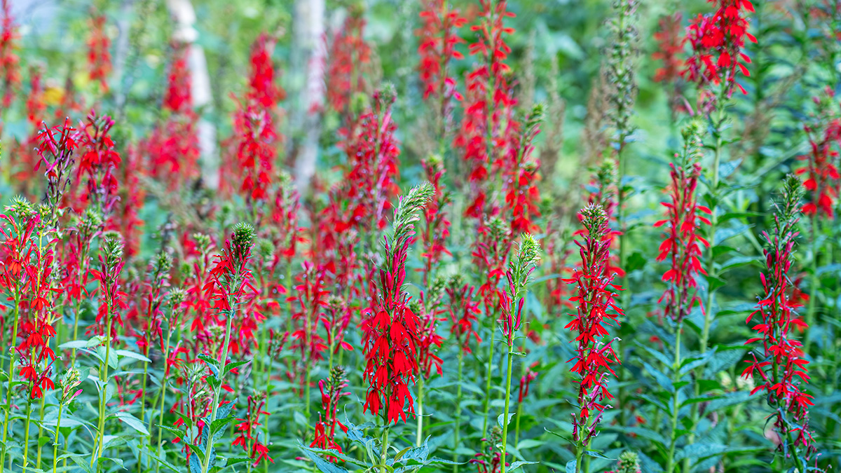
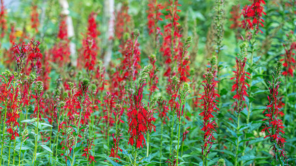
And my final image

What my edits were intended to do was take the photo from a nice scene of cardinal flowers in the woods with no real focal point
To an image where the viewer’s eye goes straight to the flowers in the front – they are the brightest, most saturarted and sharpest section of the photograph.
If you’d like to learn more about how I use Photoshop’s Layers and Masks and how you can use them to share your vision for your photographs, please join me for my Photoshop Layers and Masks Workshop on October 12-13 at my home in Bethesda. The workshop is limited to 4 students to ensure you get the personalized assistance you need.
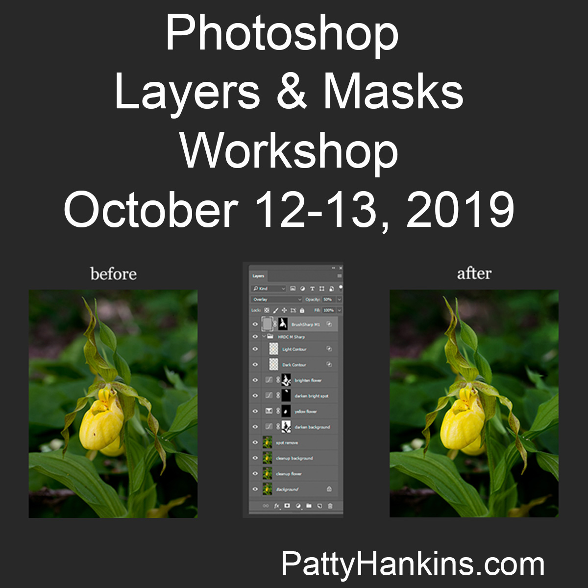
You can read more about the workshop and register at https://beautifulflowerpictures.com/store/photoshop-layers-masks-workshop-october-2019/
by hankinslawrenceimages | Sep 6, 2019 | Photo Tips, Photoshop, Software, Workshops
I’ve had a couple of questions recently about my upcoming Photoshop Layers and Masks Workshop so I thought I’d try to answer them for everyone today. The quesions were what are layers and masks? And why do I use them? Quite simply, layers and masks are the tools that let me take advantage of Photoshop’s photo editing power.
Layers
A layer is just a set of instructions for Photoshop to make a change to your photograph such as adjusting color, contrast or brightness. As you add additional layers of instructions, you are making additional changes to your photograph.
The power in using layers is that you can always go back and change the settings for a specific layer at any time and not lose other edits you’ve made to your photograph. You can also turn your layers on and off for a before/after comparision. You can also rearrange your layers since Photoshop reads the instructions from the bottom of your layer stack to the top.
If you just make adjustments to your photograph without using layers, you can’t go back and change an adjustment without losing all the edits you’ve made since that step.
Layers allow you to edit non-destructively. I almost always have to go back and tweat some of my changes when I’m editing a photo. Using layers allows me to make whatever changes I want to make at any stage of my editing process without losing all of my other edits.
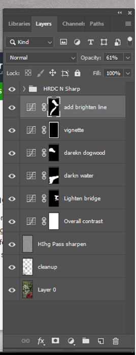
As you can see from this screenshot of the layers panel from a recent photo, I rename my layers so I know what they do in case I do need to go back and make changes at a later date.
Masks
Masks allow you to target your edits to specific sections of your image.
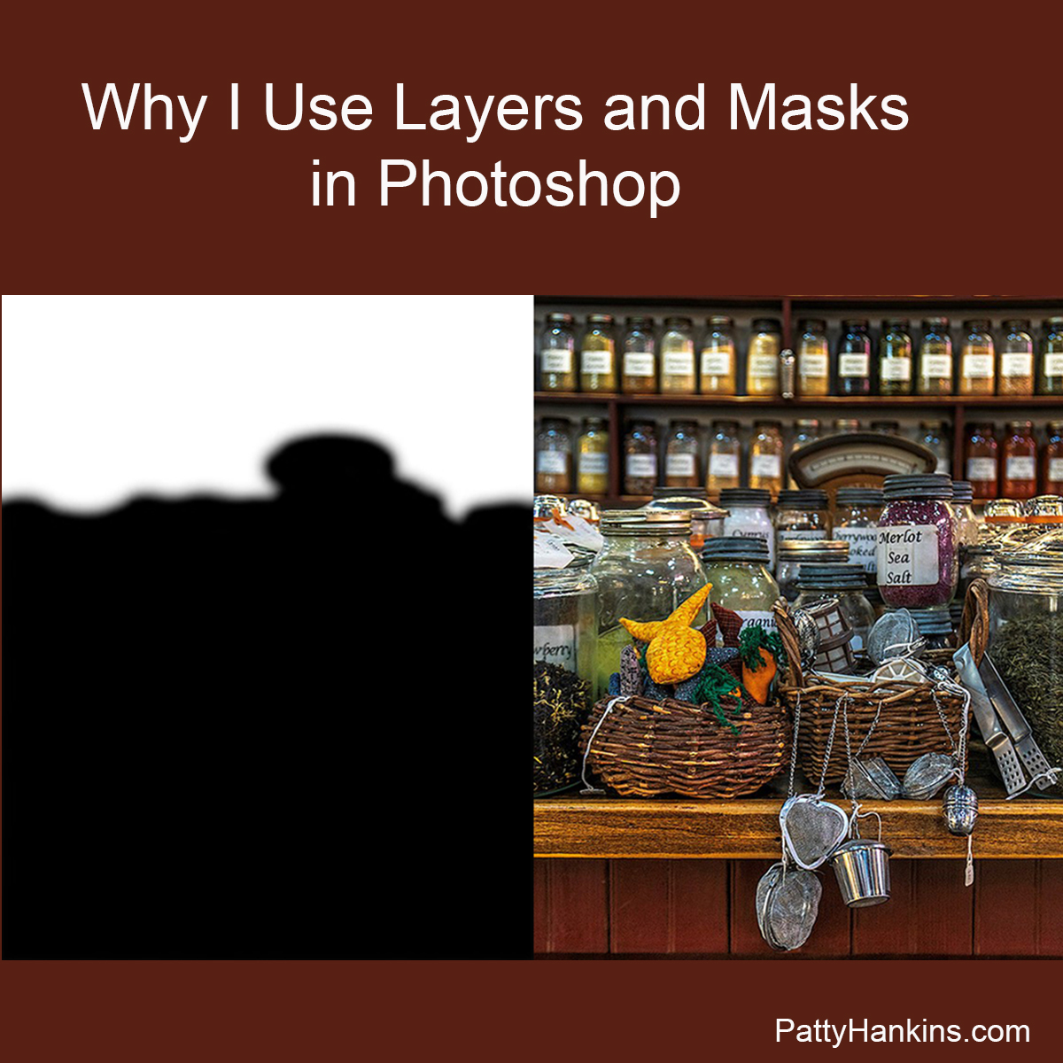
If you look at the photo of my layers, you can see small black and white squares on several of the layers. These are the masks. Where the mask is white, your change will take effect in your photo. Where the mask is black, the change doesn’t affect your photo.
An easy way to remember this is “Black conceals, White reveals.”
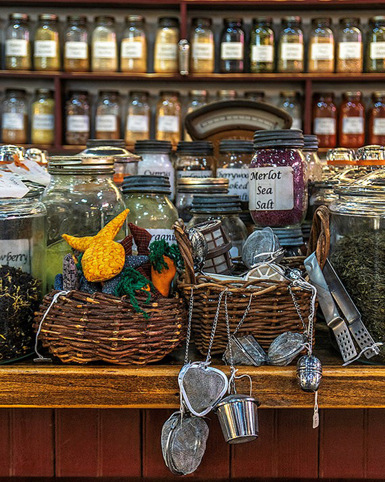
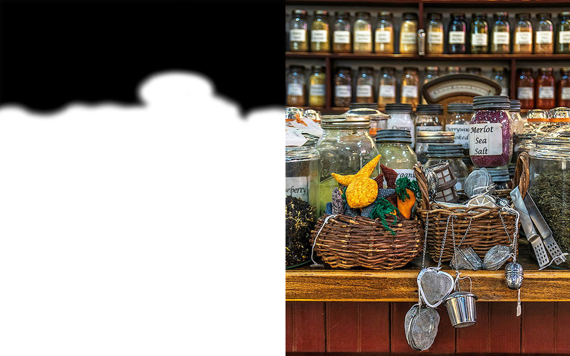
Here’s a photo from the Herb Shop at the Central Market in Lancaster, Pennsylvania after my initial edits. The background shelves were too bright so distracted from the foreground when seemed too dark.
So I used a curves layer to darken the entire photograph by the amount I wanted to darken the background. I then applied a mask where the white area covers the shelves in the background that were too bright so they would be darkened. The rest of the photo isn’t darkened since it was protected by the black area of the mask. 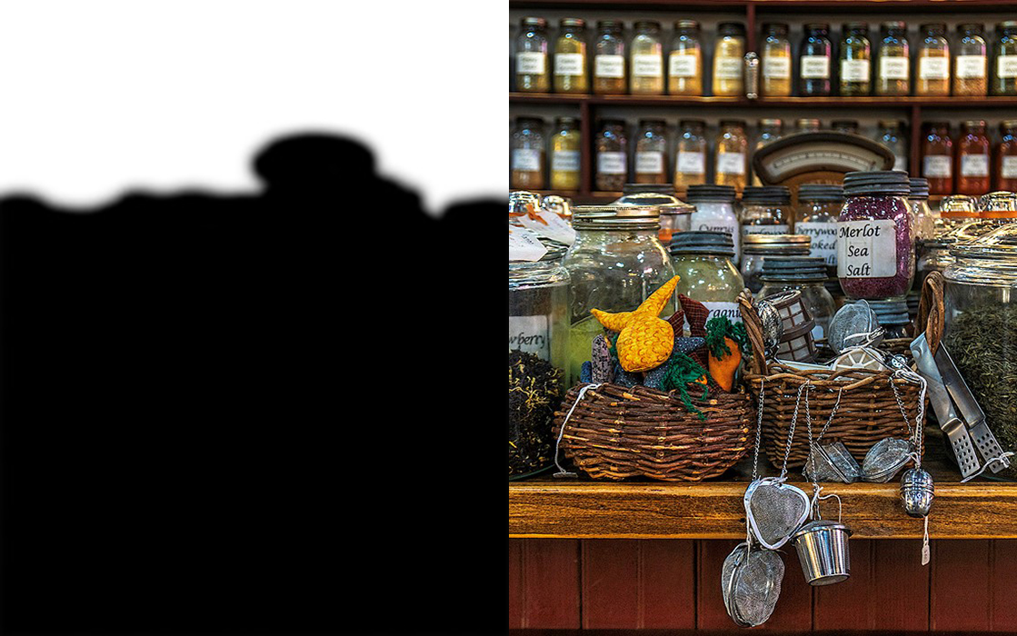
Then I used another curves layer to lighten the entire photograph by the amount I wanted to brighten the foreground. I then applied a mask where the white area covers the foreground of the photo that was too dark so this area would be lightened. The shelves in the background aren’t brightened in this new layer since the area was protected by the black area of the mask.
As you can see, using layers and masks in Photoshop allow you to make non-destructive edits to your photo, and control exactly what areas of your photo you want to be affect by a specific set of changes.
If you’d like to learn more about the power of Photoshop’s layers and masks, join me on October 12-13 for my Photoshop Layers and Masks Workshop. More information about the workshop is available at https://beautifulflowerpictures.com/store/photoshop-layers-masks-workshop-october-2019/
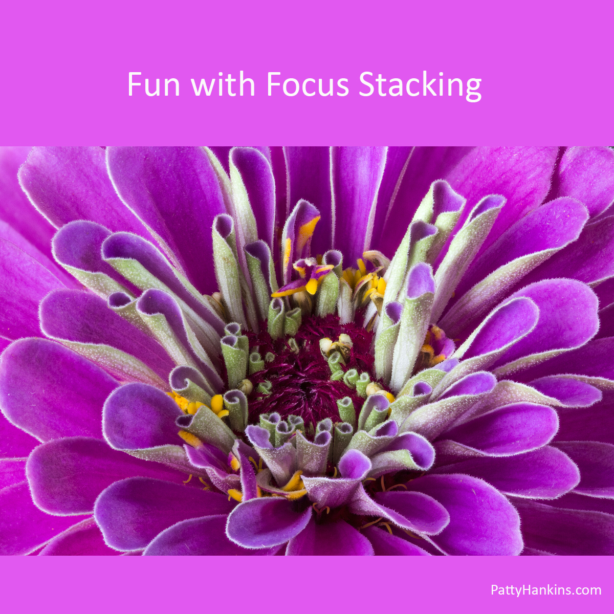
by hankinslawrenceimages | Jun 14, 2019 | Photo Tips, Software, Uncategorized
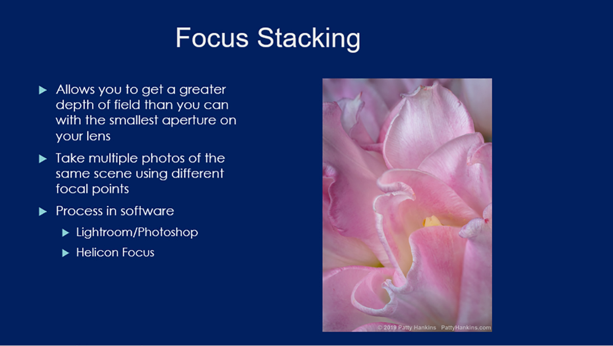
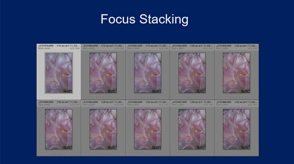
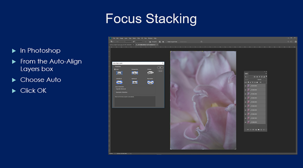
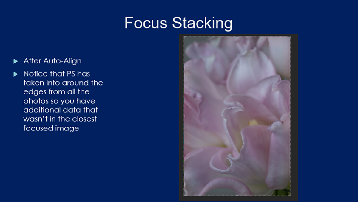
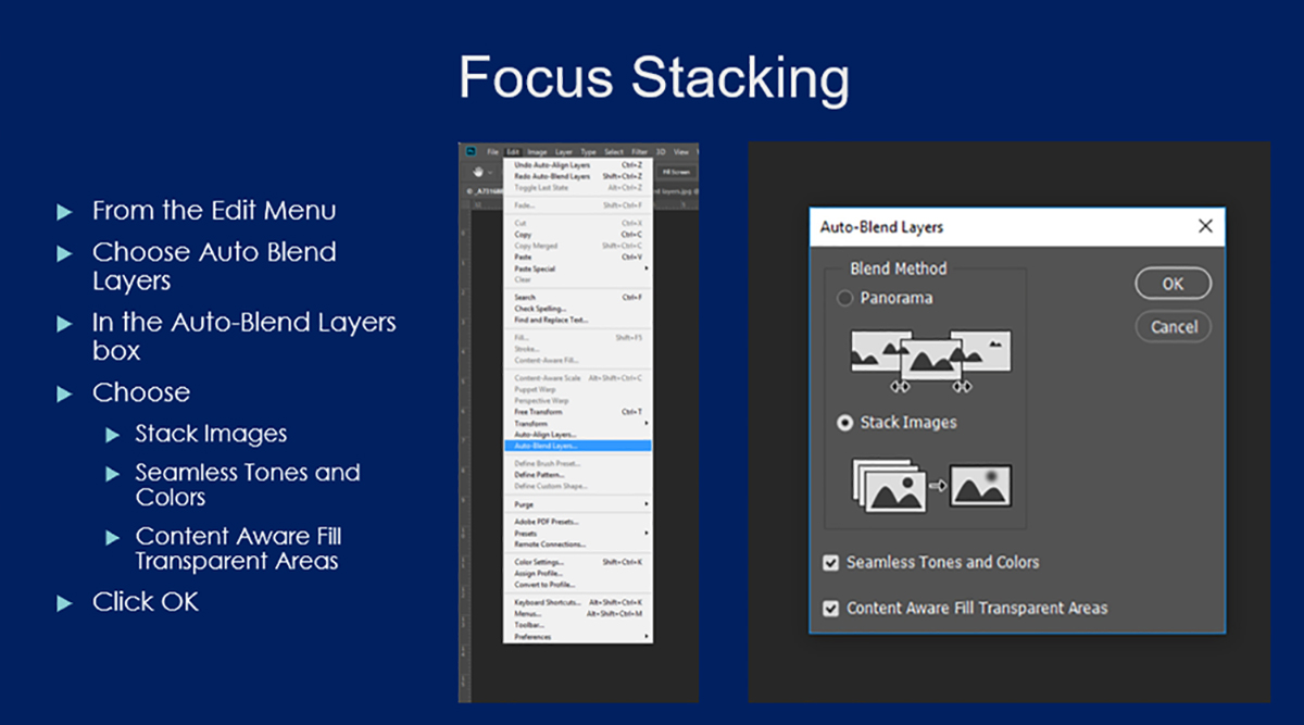
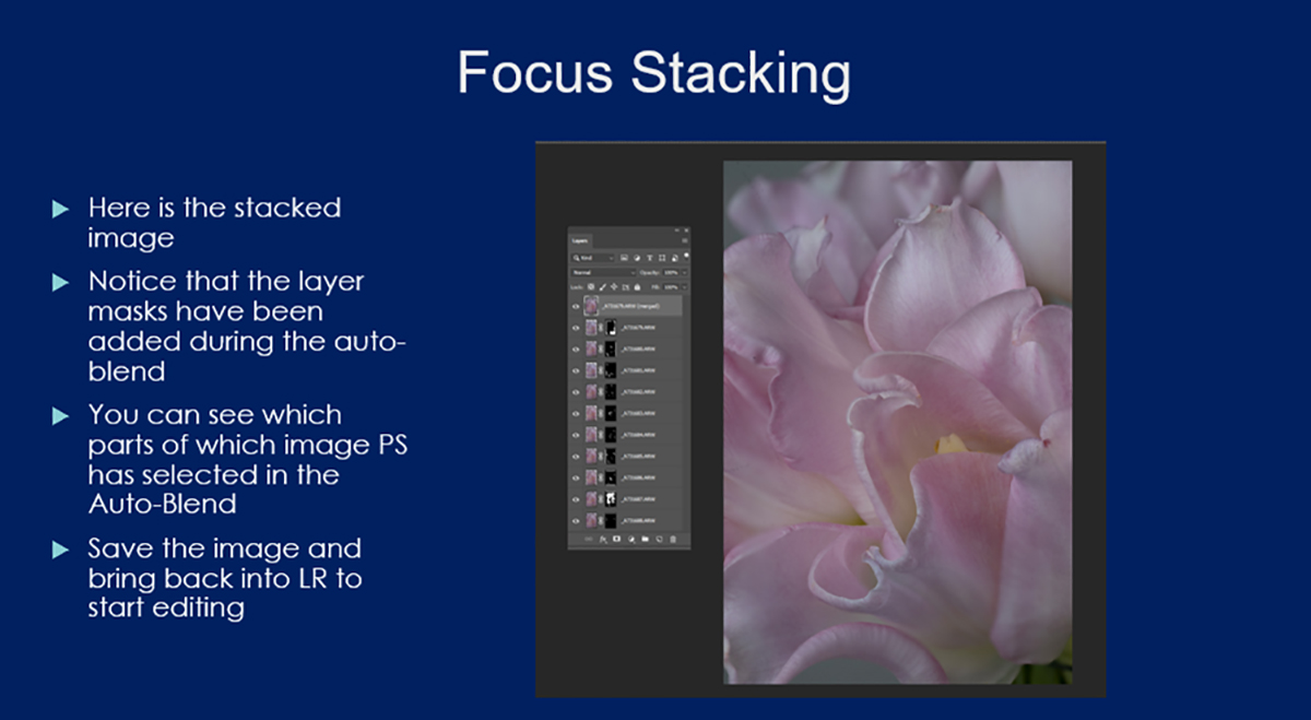
One of the questions I get asked fairly regularly is how do I get so much in focus (or so great a depth of field) in some of my flower photos that I take in my studio? People realize that since my camera is so close to my subject that it can be hard (if not impossible) to get everything the sharp focus.
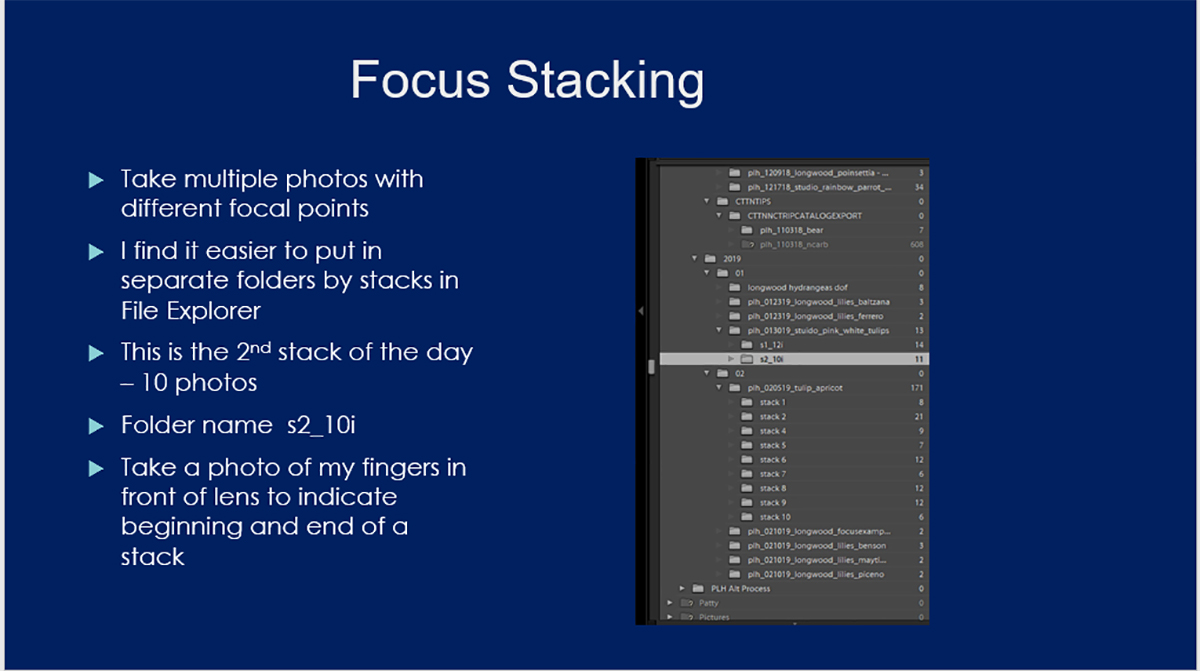
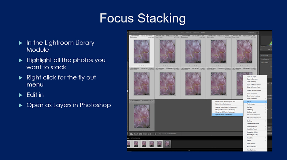
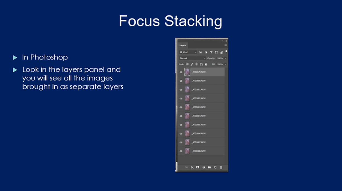
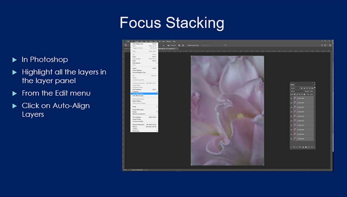
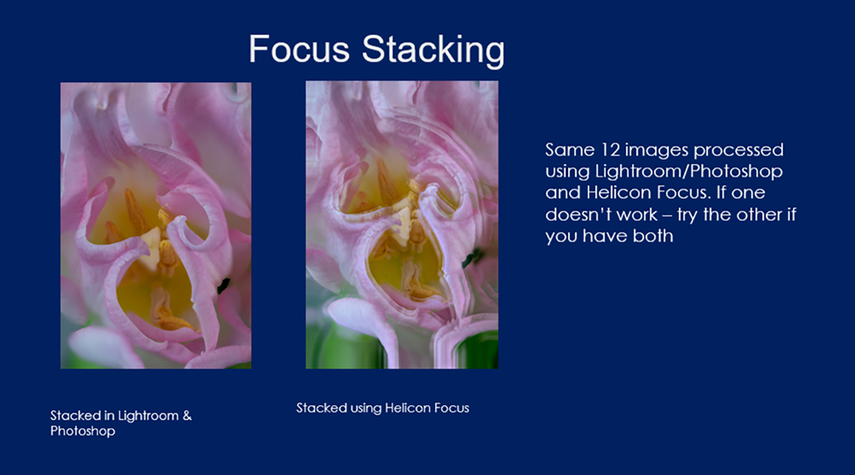
The way I do it is to use a technique called focus stacking. Basically, I take multiple images of the same scene using a different focal point for each image, and then merge the images in software to create one image with a greater depth of field than I can get in a single capture. I used to use a program called Helicon Focus from Helicon Soft for focus stacking. These days I usually use Photoshop, with Helicon Focus as an alternate if I’m not happy with what I get in Photoshop.
Here are a few of my focus-stacked images with information on how many photographs I combined to create my final image
I combined 9 images to create this photograph of a purple poppy anemone.
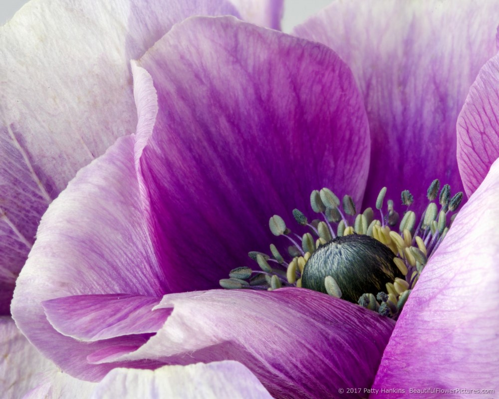
Purple Poppy Anemone © 2017 Patty Hankins
I combined 10 images to create this photograph of a pink and white tulip.
Pink & White Tulip Petals © 2019 Patty Hankins
I combined 10 images to create this photograph of a purple zinnia.

Purple Zinnia © 2017 Patty Hankins
I combined 11 images to create this photograph of a Peaches and Dreams dahlia.
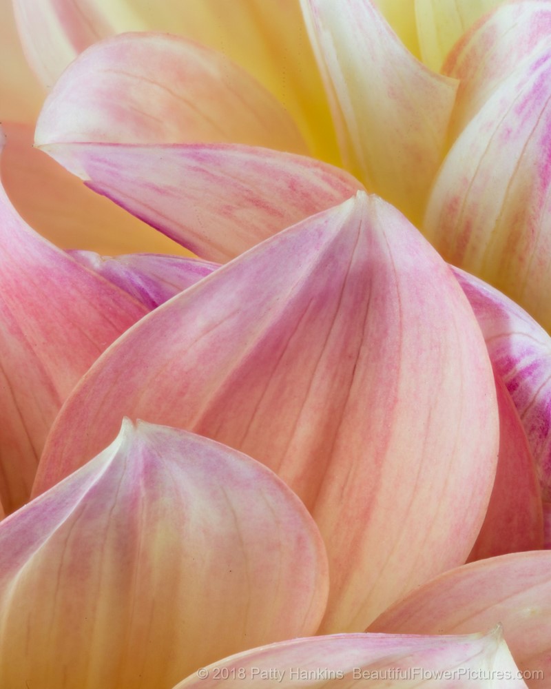
Petals of a Peaches & Dreams Dahlia © 2018 Patty Hankins
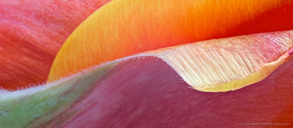
I combined 13 images to create this photograph of the Tulip Petal Wave
I combined 19 images to create this photograph of a Teddy Bear Gerbera Daisy
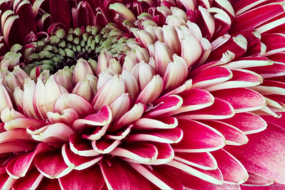
Teddy Bear Gerbera Daisy © 2017 Patty Hankins
And finally, I combined 25 images to create this photograph of Babe spray roses.
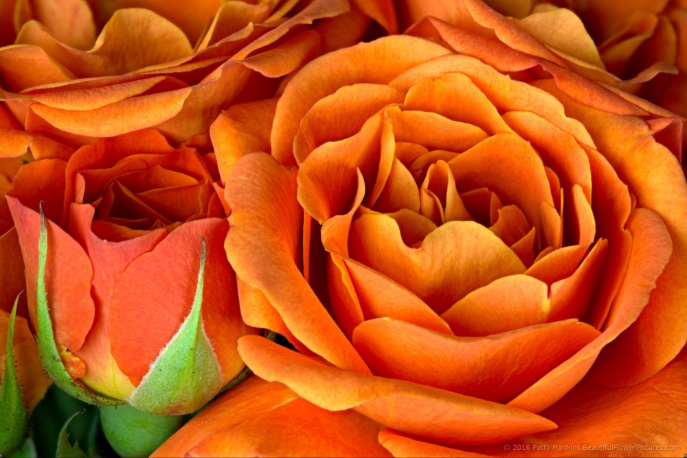
Babe Spray Roses © 2016 Patty Hankins
If you’d like to learn more about focus-stacking and how I take the different images that I then stack to create the final image, join me on July 27 for my Photographing Local Flowers in the Studio Workshop. We’ll spend some time talking about and working on focus stacking during the workshop. More information about the workshop including registration information is available at https://beautifulflowerpictures.com/store/local-flowers-workshop-july-2019/
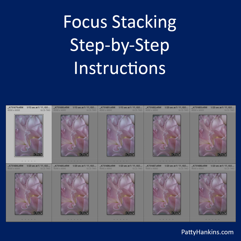
If you’d like a sneak peek at how I create my focus-stacked images before the workshop, I’ve put some slides from a talk about focus stacking on my blog at http://www.beautifulflowerpictures.com/blog/focus-stacking-step-by-step-instructions/
by hankinslawrenceimages | Jun 13, 2019 | Photo Tips
One of the questions I get asked fairly regularly is how do I get so much in focus (or so great a depth of field) in some of my flower photos that I take in my studio? People realize that since my camera is so close to my subject that it can be hard (if not impossible) to get everything the sharp focus.
The way I do it is to use a technique called focus stacking. Basically, I take multiple images of the same scene using a different focal point for each image, and then merge the images in software to create one image with a greater depth of field than I can get in a single capture. I used to use a program called Helicon Focus from Helicon Soft for focus stacking. These days I usually use Photoshop, with Helicon Focus as an alternate if I’m not happy with what I get in Photoshop.
Here are some slides for a talk I recently gave that give step-by-step instructions on how I do my focus stacking in Photoshop.
by hankinslawrenceimages | Apr 12, 2019 | Photo Tips
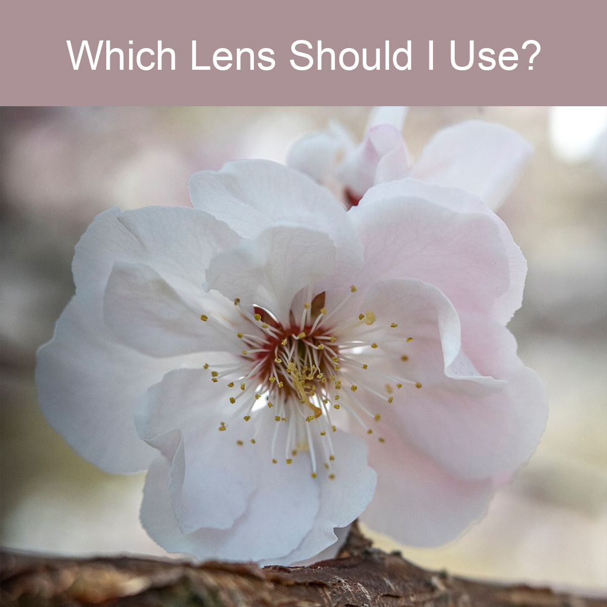
One of the most important decisions a photographer makes that will determine the look of their photograph is lens choice. Should you use a wide angle lens to show the whole scene? A long telephoto lens to compress the scene? A macro lens to get close and show all the details? A specialty lens like a Lensbaby or Tilt-Shift lens? The answer is – it depends on what you want your vision for your image is.
A couple weeks ago, I spent some time at the National Arboretum in Washington DC photographing a beautiful cherry tree with three different lens. Each lens gave me a very different look to my photos. All the photos were taken with my Sony A7iii full-frame camera on my tripod.
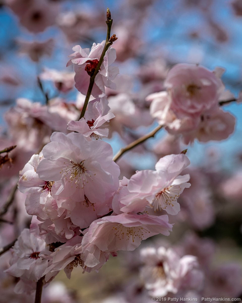
The first lens I used as my Sony 90mm Macro lens. The lens’ widest aperture is f 2.8 so I can get a very nice shallow depth of field if I want. The lens is image-stabilized so I can photograph hand-held with it without having to really up the ISO to get a sharp photo.
Cherry Blossoms © 2019 Patty Hankins
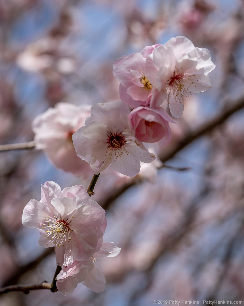
Cherry Blossoms © 2019 Patty Hankins
Cherry Blossoms © 2019 Patty Hankins
The next lens I worked with was my Lensbaby Burnside 35. This is a fun manual focus lens known for it’s swirling bokeh and vingnette effects or in other words – the Burnside gives me a great swirl effect in the background. It’s not a lens I use often, but when I do, I’m often pleased with the photos I get with it.
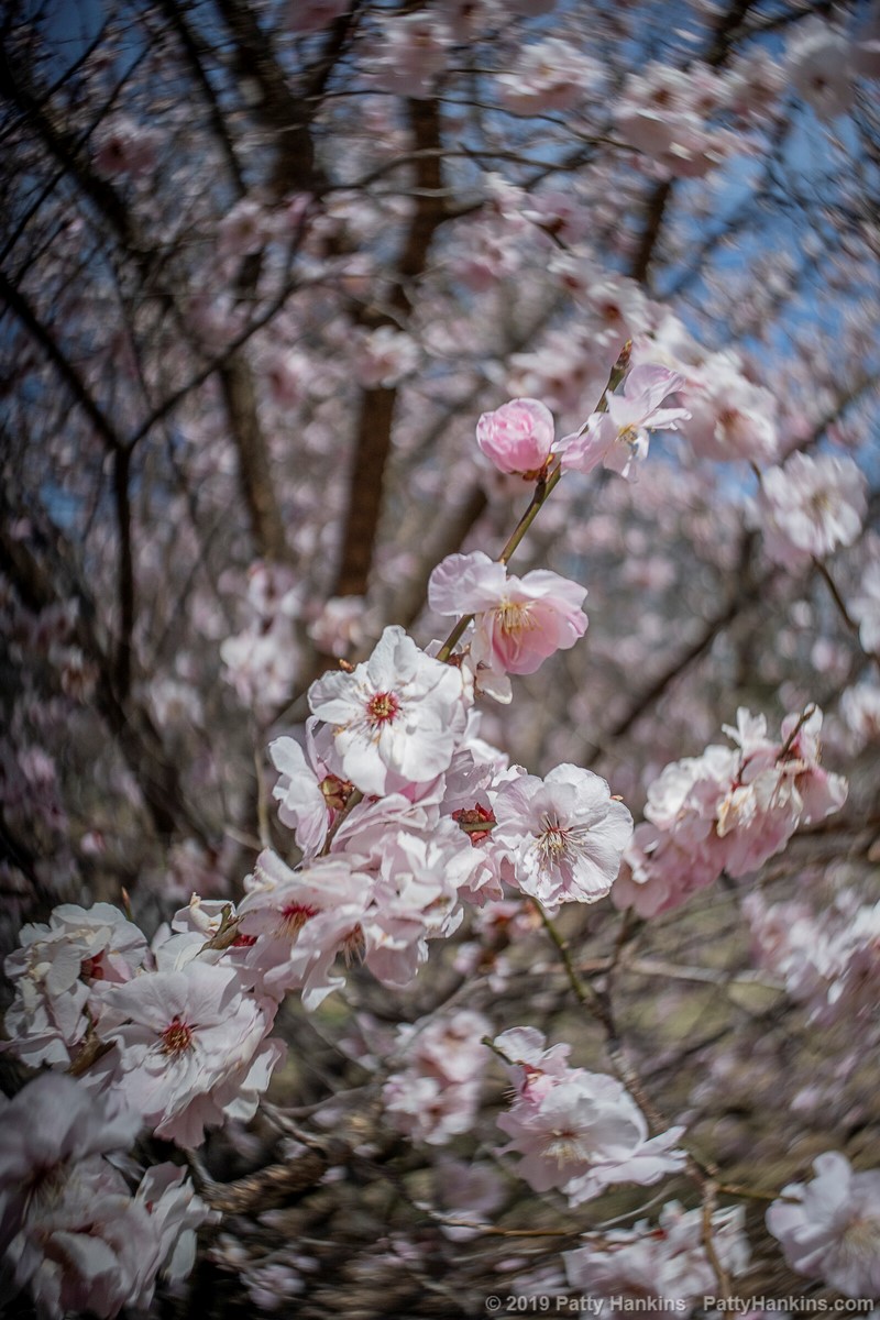
Cherry Blossoms © 2019 Patty Hankins
Cherry Blossoms © 2019 Patty Hankins
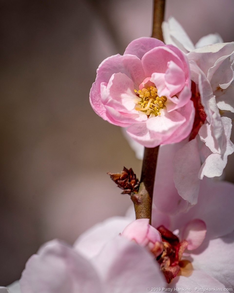
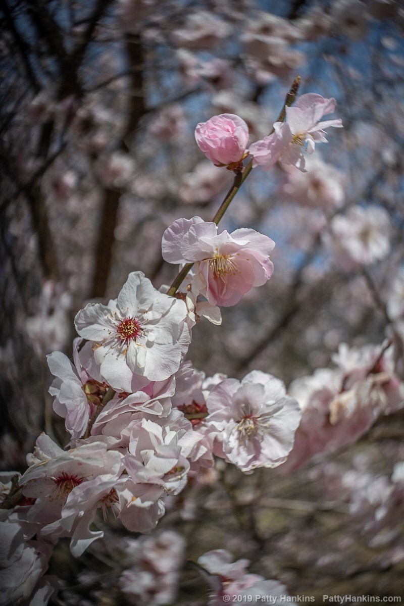
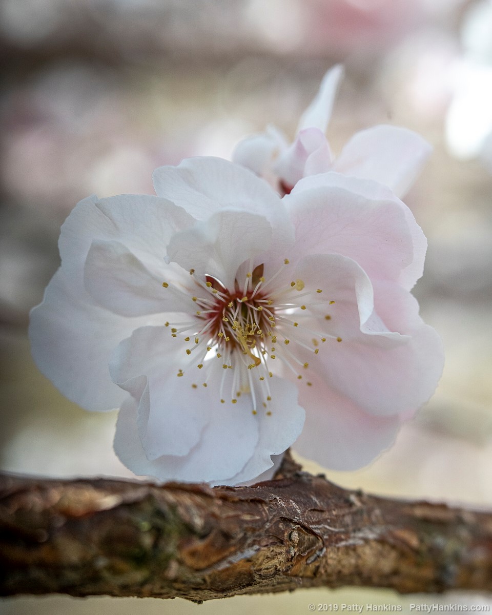
Finally, the third lens I worked with was my Lensbaby Velvet 56. Another manual focus lens, the Velvet 56 is known for it’s soft focus look especially when used wide open at f 1.6 and it’s ability to focus as close as five inches from the subject.
Cherry Blossoms © 2019 Patty Hankins
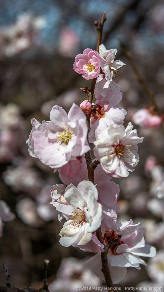
Cherry Blossoms © 2019 Patty Hankins
As you can see, each of the three lenses gives me a very different look for my photographs. And so back to the original question – which one should you use? The answer depends on what lenses are in your bag and what is the look you want for your photographs.
Figuring out which lens to use and how that choice will affect how your photo looks is one of the skills we’ll be talking about during my Gardens of Philadelphia workshop from May 5 – May 11. For more information about the workshop, visit https://beautifulflowerpictures.com/store/photographing-the-gardens-of-philadelphia-may-2019/